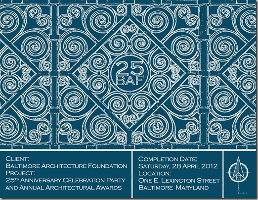
First, thanks to everyone who left a comment or sent me an e-mail about the BAF logo that I created. I played around with the image a bit more and came up with this:
We’re planning on sending a postcard to all of our members and friends (e-mail me with your address to get on the list) and decided to use a non-standard size for the card. Since the logo is square and the post card isn’t, I took the sides of the grill and added them to the original piece.
Then I found an early 1900’s blueprint so I could see how it looked and try to approximate the style. 
The worst part is that I can’t find a font that is similar to the one on this print, and I am getting a bit obsessive about it. Suggestions?
So, without further ado, here’s what I’ve got so far.


I think you are fabulous and so talented!! Love your efforts for such a wonderful cause!
ReplyDeleteFrancie
Beautiful. The square reminds me a bit of a Moroccan tile. It's a gorgeous blue.
ReplyDeleteGood luck with finding the right font.
Laura Lee
What William said....and I hope you find the font, too! Knowing you, it is as good as DONE!! You are just AWESOME!!
ReplyDeleteI too hope you find the font. I am a stickler for consistency with spelling things out/abbreviations so I would spell out East in the address - that abbreviated "E" drives me nuts.
ReplyDeletei as the devil's advocate --is not a logo something that a company adopts to brand its image with. the 25 --is it clear the number represents a one time event-- the anniversary?? ( is this then not a logo)--try dropping the 25 and using the BAF only in the image. what about the renderings - screen the drawings at 20 percent or drop them out on the back or on the envelope
ReplyDeleteI really like what you've done so far -though I do think the BAF 25 needs some work so it pops out to the reader.
ReplyDeleteI googled Edwardian-era fonts and found these:
http://www.fontscape.com/explore?7LI
It's lovely. I still think the BAF 25 needs to stand out more, though. It's competing with some very busy design, perhaps make it larger?
ReplyDeleteThere's no time listed for the party.
I like what did with the color, but I agree that the 25BAF needs to stand out more. Is that the florescent motif that you used? Perhaps stay with white outline but go with a less busy gate rendition like the stone.
ReplyDeleteGood luck!
wow - GREAT solution -this looks fabulous!
ReplyDeleteI really like your finished design. I, also, agree with others that you are very talented! Although I do not comment often enough, I enjoy, daily, your posts!
ReplyDeleteLooking good Meg! Have you tried whatfontis.com it's a font identifier which may help, there are several online.
ReplyDeleteGood luck.
Di
X
Or try
ReplyDeletehttp://new.myfonts.com/WhatTheFont/
at myfonts.com. Works for me every time!
Love the latest sample!
I LOVE IT.
ReplyDelete