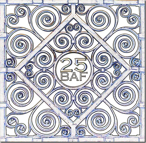
As I mentioned, I am designing the invitation for the Baltimore Architecture Foundation’s 25th Anniversary party in the late spring, and I decided on a bronze grill detail for the motif for the party. I added the 25 and BAF in the center space.
I cleaned up the image, so that the only the brass grill showed. Then I started playing with the image, since I thought it was looking a bit plain. For years, I’ve been using Photoshop, but in my last computer upgrade, I didn’t have the disks to install it, so I am using Photoshop Elements. PSE costs about 15% of what a full PS suite does, and seems to do almost everything I’ve needed it to do.
Now for the hard part. Which one do you like best? The invitation will be a post card directing people to the website, and also several e-mail blasts, as well as a page on our website.
Thanks for your help!


No matter which one you choose, I think the BAF 25 needs to pop more -- maybe by change of color, expanding size, or somehow "raising" those letters/numbers.
ReplyDeleteAt first I liked the un-Shopped original (gold), but now am leaning toward the red, perhaps with the writing in a glossy black?
I, too, like the un-shopped version. It might be interesting to have the 25 BAF actually appear as part of the grille, if it would still be readable. I suppose true embossing would be too expensive? Alternately I would like the grille with the 'shopped embossing in white but the 25 BAF in gilt.
ReplyDeleteThe Outline has some qualities of an old blueprint, which is nice.
ReplyDeleteIs not silver associated with a 25th anniversary? What is the budget-- what is the cost of the inks? how many invitations could u use mylar some how? simple invitations but jazz up the decorations with mylar balloons Does the BAF have a logo to use
ReplyDeleteI don't know if it's because I know about tag board and tape but, as pretty as the first image is, it's not my favourite. I thought it would be the stonework effect, but the neon edges made me think 'art deco' and I like that one best. Any of these (except the stamp, which I didn't care for) would be marvelous, but I would vote for 1. Neon; 2. Stonework. Look forward to hearing what you choose!
ReplyDeleteDefinitely between Stone Carving and Neon Edges... Looks great! xxxx
ReplyDeletePersonally I think the stone carved image is attractive, however the outlined image is reflective of the open work of the gate.So if you could change the color of the outlined image to a bit of a warmer shade,then that's the one.
ReplyDeleteI like the stone carved and the neon edges are interesting but have a less serious feel. Your first image is great too.
ReplyDeleteI agree with Tish about the logo popping more. When I first saw the image I didn't see the 25 BAF at all. Once I noticed it, it popped like crazy. If I got the postcard I might not have looked as hard. I think the neon edges looks a bit like a blueprint which I think is a clever nod to a group whose interest in architecture goes deeper than the average Baltimorian.
ReplyDeleteOf course the last one has a blueprint feel as well.
ReplyDeleteI really like the Neon edges if you can bold or make your center logo stand out more!
ReplyDeletexoxo
Karena
Art by Karena
I have to boringly agree that I prefer the un-photoshopped version myself -the photograph. Might be interesting to use the rubber stamp version elsewhere though -thats really cool! I still have my computer from grad school (10 years later) because i'm reluctant to part with my photoshop!
ReplyDeleteMy favorite was the original. I also like the mezzotint and the neon. Sounds like a wonderful event to work on.
ReplyDeleteHi Meg, Hard choices as they are all great. There are three that I really like. Stone carved, original and neon. So hard to pick as don't know what you are aiming for. The Neon really gives it an Art Deco feel. Be well. Mary
ReplyDeleteMeg, first of all, I select YOU. Your idea is superb, your spinoffs are genius, the way you fit "25 BAF" in the center is striking. I salute YOU. You're right, it is "plain" and that's why I like it so much, so I'm partial to the unshopped, but am curious to know whether the image is an extant grill located somewhere in Baltimore. If so, I'd love to see a teeny-print architect's name/location/date attribution running along one of the edges.
ReplyDelete-Flo
I like the outline, with neon edges as a close second. I like the draftmanlike quality they have.
ReplyDeleteI vote for #3!
ReplyDelete1 original 2 stone
ReplyDeleteI love #3. What a grand job, Meg. xxpeggybraswelldesign.com
ReplyDelete