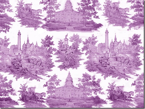
I finally worked out the best way to finish up the Toile de Baltimore/Maryland, and that was to completely get rid of all of the colours and just pull it back to black and white. Because the photographs of the toile came from such different sources and were shot in such different lights and environments, getting rid of the colour was the only way I could assure that I got the same colour.


Check out this link on Spoonflower to see a lot of other toiles that people have designed.


Hi Meg I love Toilles and this one is gorgeous in all shades!!
ReplyDeletexoxo
Karena
Art by Karena
Congrats on the mag...you inspire!
ReplyDeleteThis is great work Meg, quite impressive.
ReplyDeleteI love the new look. The various colors distracted me from the images and gave the toile a more dated feeling Great job.
ReplyDeleteI love the blue and white and the purple and white! Great job!
ReplyDeleteDid you ever / have you made this available for purchase?
ReplyDeleteI had some printed but wasn't wild about how it turned out. Email me and we can chat.email is in profile.
Delete