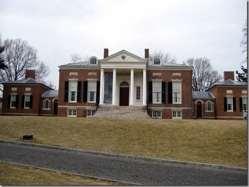
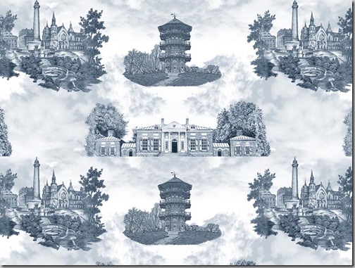
After lots of great advice from museum curators, historic house directors, historians, interior designers and my mother, I’ve come up with a final draft of the Toile de Baltimore.
We have found out that the original Toile de Baltimore/Maryland that we found was most likely produced by one of the local department stores in the late 1940’s, probably as part of an anniversary of some type. 


I am almost at the final part of this, seeing how it looks as a large repeat and deciding how large or small I want to make the buildings. Once we finalize that, we will send some files to Spoonflower and see what we get!


Impressive. I mean it.
ReplyDeleteFascinating work!
ReplyDeleteBrilliant Meg! Do you give online courses!!
ReplyDeleteKarena
Art by Karena
It's not just that I love the fabric, but I am giddy that you have let us in on the process which has been so interesting. Beyond impressive.
ReplyDeleteI love toile and your post was fascintaing!
ReplyDeleteVery interesting process - and an impressive talent you have! Love that you added the Homewood House of JHU - also one of my favorite sights to see each visit.
ReplyDeleteThis is so classic and that Pagoda is such a nice addition. Well done!
ReplyDeleteWell I'm sorry the State House had to go but it is in Annapolis of course. I am quite impressed with your perseverance on this one Meg! Brava!
ReplyDeleteMeg, you have been a real tour de force lately. You are amazing! I love the toile so much!
ReplyDeleteHow lovely to be working on a toile for your wonderful city. It looks to be a beautiful colour of blue grey.
ReplyDeleteTo me the buildings are too far apart and need to drift into each other more, possibly linked by exending branches. Also, the ground line of the pagoda is two straight and angular at the bottom. Homewood house is lacking a suggestion of land in front of it, so it doesn't harmonize with the others.
If you look at the original toile, the entire periphery of each vignette is very irregular, and they are positioned closer to each other, almost touching. In the classic, 18th century pastoral toile, the scenes drift into each other, usually with tendrils of plants or branches or ornamental arabesques. I think your design will benefit from the buildings being more closely linked.
Possibly photocopies of old copperplate engravings of trees or branches, or even those in the original toile could be cut out and repositioned. I also think that having human figures as in the original adds charm and perspective. The standing couple might be reused, with the monument behind excised.
I think the original would also be lovely and look more "toile de Jouy" if reissued in monochromatics. What an interesting and historically significant project you are working on.