When I saw this house just outside of Baltimore, listed as “French Opulence” my first thought was that the French would be spinning in their collective grave to see this attributed to them. It looks nothing like any French house I’ve ever seen.
Most French houses I know have graceful, elegant proportions. This one doesn’t. That balcony sticks out like hernia. The columns on the portico are too low for the depth. It looks like the the 2nd floor porch and its appendage are weighing the columns down.
The whole entrance looks like an addition because it completely blocks the two Palladian windows on the second floor and ruins the lines of the house.
Let’s go inside, shall we?
First, I think these front doors would look a whole lot better with some glass in them. The wood is just to heavy and dark.
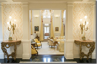
I am not a big fan of cathedral ceilings and double-height rooms. They tend to feel cavernous, like you’re sitting in the bottom of a well.
Loooooook…. down there… furniture! (that’s my echo-y voice!)
I am also not a big fan of the “window treatments” in this room. I’d have left the top windows undone, and not curtained the bottom doors. In a room this tall, you don’t need to draw attention to the height. Also, the furniture seems out of scale for the size and height of the space.
There are a lot of decorators who can successfully use a lot of pattern in a room, but this seems very jarring and not at all harmonious. If you took away one of the major elements, like the rug, it might work better.
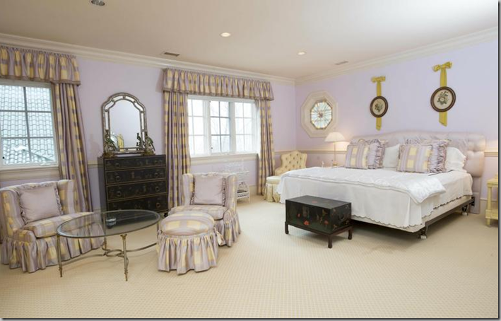
Again, too many patterns in this room. And someone needs to explain to me what’s over the bed. The elements either need to be bigger, or closer together to make a unified assemblage.
I think that the bed’s missing something! There are at least a dozen pillows, but no skirt?
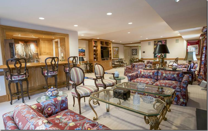
This room certainly sends a mixed message! That wall map of the world seems a bit out of place. And it’s a bit over-ottomaned, too.
Way too much happening in this room. Too much furniture. Too many patterns. Too much happening.
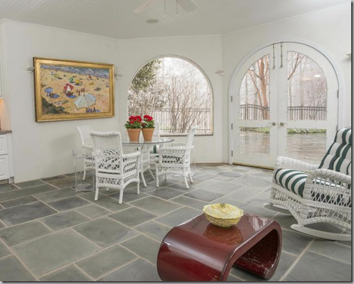
Why would you have a sun room with wicker furniture and then add a modern table?
There’s way too much furniture on this porch. It looks like it would be a maze to get from one end to the other. I think that the furniture needs to be airier. These kooboo chairs are too heavy and there are too many of them.
There was one thing I did like about this house. This.
The property was built in 1992 and is on the market for just over $2 million. Regardless of what I think of this house, someone is going to love it and make it their home. Email the agent, and my friend, Jake to see it, or check the listing here.


I blame Computer Aided Design (CAD) for these monstrosities that can be regurgitated in a short amount of time with little effort. But the truth is that some of these horrors are built with almost no drawings or specifications at all.
ReplyDeleteThe gate was bought through a retail source such as Walpole. That's why it bears no relation to the house, and is better for it.
I call it "point & click" architecture. I'll take two of these windows, a dozen of these balustrades, a big porch, etc.
DeleteOh dear god. The decor, while not to my own taste, is competent. The architecture is alarming. At no time in history has elaborate been more badly done than in our own---all the laws of proportion and scale have been thrown out the window in favor of a cacophony of 'detail' rendered up from stock parts. So very horrid.
ReplyDeleteThe portico was added later and is so out of scale with the rest of the house. That rounded part looks like it could topple off at any point.
DeleteHello Meg, The entrance here is just plain ugly, and most of the other photos look like a hotel. So much new architecture in Taiwan is also like this--overwrought and pretentious.
ReplyDelete--Jim
It does look like a hotel. Especially that long hallway.
DeleteMuch money, no taste.
ReplyDeletevery much money, as i have now heard.
DeleteWow. As Neicy Nash would say, "That's a hot mess." Does no one understand proportion any more? It absolutely screams nouveau riche. I call it "poor people's idea of how rich people live." That sounds snobby, I know, but I sort of get the feeling that the lady of the house decorated it herself, opining to her friends, "Who needs a decorator? I know all about design. I go to the decorator center all the time and everybody knows me there." As though that makes her knowledgable. No amount of money, new or old, can bestow taste.
ReplyDeleteself-made money!
DeleteHot Mess for sure -this is horrendous..... not even sure if you could fix it. Those aren't Palladian windows though -just arched transoms - Palladian Window is a whole 'nother beast altogether. I'm sure they would have gotten it wrong though had they had one.
ReplyDeleteI should have said pseudo-palladian...
DeleteFrom this designer's point of view, it is an abomination. So sad when people are that clueless.
ReplyDeleteTruly hideous. A perfect example of too much money and not enough taste (and restraint) or the knowledge of what is appropriate to French style/architecture. The "decorator" was probably laughing all the way to the bank as many of the design elements are obviously expensive. How sad that people are either taken advantage of because they don't know better (education re the elements of French style) or because they want to show the world that they "have arrived."... Kathy Merrick
ReplyDeletePainful.
ReplyDeleteLet us not forget to mention that the columns and balcony are a completely different color than the rest of the house, as well as being completely out of proportion. And what's with putting all the furniture in a tight circle at the bottom of the well? Jeez. See, people who have no taste should not have all that money. They should transfer it to my bank account immediately, and I could restore my 1925 house and cottage PROPERLY. 8-)
ReplyDeleteDisturbing and disproportionate come to mind.
ReplyDeleteBlimey
ReplyDeleteSigh......
ReplyDeleteHi Meg, This is type of house that I call "Fugly"......I love the echo description. There is one piece of furniture that is probably either Maison Ramsay or Jansen--living room coffee/cocktail table. Other than that---not so great for the money invested. xoxo Mary
ReplyDelete