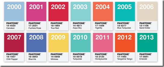
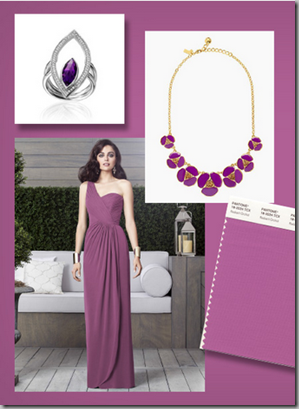
Pantone®, the colour people, have picked the colour of the year for 2014 and it’s Radiant Orchid, a blend of fuchsia, purple and pink undertones.
I am a bit more on-board with this colour than I have been with several of the past ones like last year’s emerald green.
I can see it more as an accent shade than a whole room – unless you’re six years old.
Pantone says it chose the color because it produces a rosy glow when worn, looks good as a lipstick and, in interiors, is a nice combination with olive, hunter green and turquoise.
What do you think?


I think it's gaudy.
ReplyDeleteI am OK with the color but in small to medium amounts. However, why does it have to be radiant orchid? Orchid alone conveys a satisfactory idea of this color.
ReplyDeleteHideous. I don't know why we need a color of the year anyway--obviously a cheap commercial publicity stunt which we should just ignore.
ReplyDeleteI don't like it and it reminds me of colors that the BBC home makeover would paint bedrooms with solely for an impact. I only see it catching on in lipsticks...
ReplyDeleteI need a lot of design and i liked your design to use for my house. Thanks a lot to this design. Interior design ideas
ReplyDeleteIt's a hard color on the eye and should be used sparingly.
ReplyDeleteSo we have Michelle Obama to blame/thank?
ReplyDeletehttp://www.dailymail.co.uk/femail/article-2518744/Did-Michelle-Obama-influence-Pantones-color-year-First-Ladys-favorite-purple-hue-chosen-2014.html
I hate it hard.
ReplyDeleteI think it's great publicity for Pantone.
ReplyDeleteHmmm....it looks suspiciously like mauve. Your blog is fab! Have a great weekend! XO, N.G.
ReplyDeleteIt works for a real orchid. And cosmetics.
ReplyDeleteNope. Unless it's paired with teal, and then Super Nope.
ReplyDeleteI think it's pretty -these 'color of the year' things are so ridiculous but I have been seeing a lot of purple around lately. I remember last year when we were told at Highpoint that Emerald was the color of the year and I put it on my blog. Someone from Pantone denied it and sent me rude emails asking me to remove the fact from my blog. Low and behold one week later -the color is Emerald. SO OVER THEM. haha
ReplyDeleteI'm not a fan. I like deeper purples, but not this one.
ReplyDeleteMauve redux.
ReplyDeleteOK I am a lavender kind of girl + not so much this color? xxpeggybraswelldesign.com
ReplyDeleteHmmm... The Color Fascists at Pantone Strike Again! ;-)
ReplyDeleteComme ci comme ca!
ReplyDeleteI can see it going wrong in most people's hands but I also think it is quite beautiful. I have no use for it, but I do like it.
ReplyDeleteWhen I worked at Parish-Hadley in the 1980s, members of the media were always pressing Albert Hadley to declare a color as the most fashionable of the moment. He always said that there was no such thing.
ReplyDeleteFor me, there's not one appealing thing about it. What a random choice.
ReplyDeleteNewly Rich Milano 1936 .... I have stayed in two flats in the center of Milano where the bathroom fixtures were close to this. Now, many years later the family can't afford to replace them. GB
ReplyDeleteUm, no. Coral for me, thanks. Bright, orangy-pink coral!!!
ReplyDeleteHideous!
ReplyDelete