I am largely self-taught on Photoshop, and now PS Elements. I occasionally pick up a magazine that has PS tutorials, like PS User or Photoshop Creative. They have great tutorials which walk you through the process of editing an image. They frequently come with a CD so that you can use the images that they’re using for the tutorial.
I decided to play around with a couple of the shots I took in Wales, just to practice some techniques.
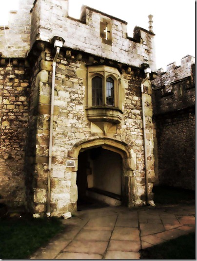
Here’s the first before shot. The entrance from the courtyard into the main building. Nothing special. Colours are pretty true. It shows a scene I saw every day.
Certain parts of the new image really pop out and other’s recede. The little window above the door is much more noticeable, and the arrow slot on the crenellations really shows up now. Some parts of the image are sharper and others blur. I wouldn’t want all of my pictures to look like this one, but it’s kind of fun to play around.
This is all accomplished with layers, blending and blurring. It takes a little time to get used to these techniques, but if you don’t like the result, just say no when it asks if you want to save it… or better yet, work from a copy!
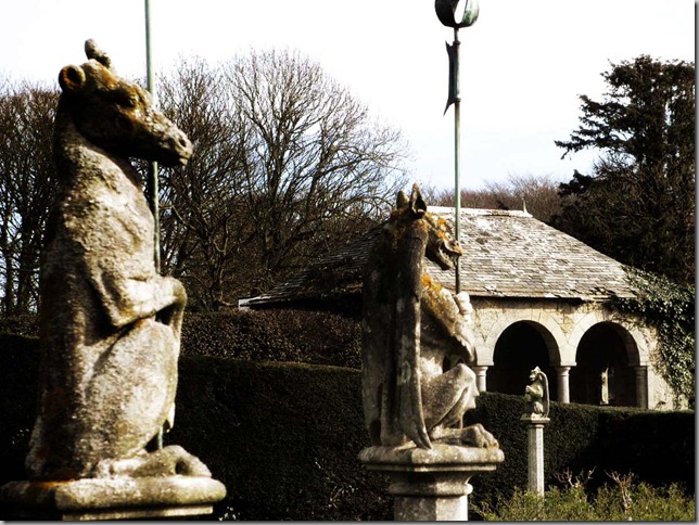
Here’s the second image I played with. I have to say, this is one of my favourite shots from the trip. Here’s the before:
It was a hazy day in early spring, so there’s not a lot of colour. I like the way the hedge leads your eye across the picture from left to right.
There’s almost a sepia tone to this image. The third beast, on the right, seems to stand out more, with the arches in the summerhouse being darker.
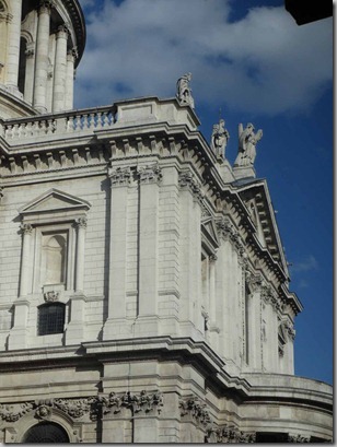
For something completely different, here’s St. Paul’s in London.
I have PS Elements, which is less than $100 to purchase, a significant savings from the Photoshop suite at close to $800. I can do about 85% of what I’d do on PS as I can now do on PSE. Regardless of which photo program you have, play around with your images a little. It will do wonders!


I really like the third image. I work with photoshop and love its power! But I have to say, the most important thing to me is taking an excellent image to start with and then the editing is minimal...!
ReplyDelete:)
I agree! I edit almost every photo just a little, either to lighten a little or darken a bit. But no substantive changes.
DeleteThanks Meg, it's been too long since I've played with photoshop and now you've inspired me to get with it! Definitely need to check out PS Elements, what a difference you made with your photos! Have a great Sunday.
ReplyDeleteThere are also a ton of videos on PS... including the hysterical, if a little vulgar, Photoshop Sucks.
DeleteMeg,
ReplyDeleteI prefer all the afters, they have so much more atmosphere. I use PS but my knowledge probably extends to only about 10% of the programme.
Di
X
The PS Creative magazine is published in the UK. It's about $15/issue here, so should be significantly less expensive on your side. This was a tutorial called something like Faded Memories. But i was well pleased with the way the images came out.
DeleteThe afters are stunning.
ReplyDeleteThanks, Tish!
DeleteThese are incredible! I am a complete techno-idiot when it comes to such things. Congrats on your progress! RD
ReplyDeleteThanks, Reggie! I have been doing PS for work for ages, but not the creative fun stuff like this! I love learning new things.
Deletevery clever of you, your photos look fantastic, I also love the photo of the woman sailing.
ReplyDeleteSMR... that's my mum, pre-children!
Delete