I’ve been somewhat inadvertently collecting transfer-ware plates with scenes from the British Isles on them, and now that I have about 10 of them in black, red, blue and purple, I’ve been thinking of what to do with them. Since my main room is just one large room, sort of divided into a living area and a dining area, I thought it would be fun to use the plates over a serpentine-front dresser I have. I had two pictures above it, but moved them to the other side of the room to have a gallery-style arrangement of pictures.
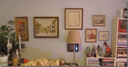
Here’s what it looked like just after I moved the pictures from the other side of the room. The picture above the lamp is a sketch of Venice on the back of an old magazine that my parents got form a gondolier in Venice. The engraving above the house picture (read about it here) is of Chepstow Castle on the Welsh borders. I used to go to Chepstow Race Course when I lived in Wales, so this brings back memories.  When I was at my mother’s for dinner, I remembered that she had a stash of pictures that hung on our old house, but that she didn’t have hanging in the new one. So I asked to rifle through them to see of anything appealed to me. I found a watercolour from 1971 of an alley in Vienna that my father had picked up on a trip.
  Once I hung it, I realized it went brilliantly with the other painting I’d gotten last year. The colours and the subjects are very similar and they work perfectly together.
The other picture was a tiny photograph of some boats at a mooring in Chester, England from 1908. It is from my father’s family, and it encompasses my love of sailing and my background in the UK.  It was too difficult to capture the photograph, but you can see it right under the lamp. I still have one more picture to hang, but I need to work out where it will go in the arrangement.
So, I need to hang the other side of the room, but I thought I’d leave that until I get back from the UK in a few weeks, since I am hoping to pick up another plate or two that will be souvenirs of my trip. However, I played around with some arrangements for the plates.
Thank god for Photoshop, so I can work out the arrangement before I hang all of the plates. I have mostly blue and red plates, but I have one each in purple and white. I can’t decide whether to hang the plates in a symmetrical arrangement, or just randomly.
Any suggestions?


Use the plates as plates.
ReplyDeleteHang them symmetrically...! The photoshop thingy is brill. I use a belt and braces approach - brown paper cut outs blu-tacked where the pictures will/should go.
ReplyDeleteI feel like I would take the little photo of the boats mooring (or maybe the little picture right over the American flag) and center it at about eye level over the dresser where you were thinking of putting the plates. I often like to make a small treasured picture the center of attention. Then I would leave the other pictures in their same arrangement, but move them closer together (and add to them over time). And I would see if the red plates could be worked into that arrangement, and save the others for another space. But I feel like your pretty grey walls are not setting off the plates enough. I would like to see them against a color.
ReplyDeleteUsing photoshop to pre-hang pictures is brillant.
What treasures you have! It is so nice to hang them so they are a part of your life each day.
ReplyDeleteI suggest the plates hanging at random. I feel the symmetrical arrangement would look contrived.
I recall seeing a Martha Stewart post, years ago, on hanging pictures and platea. It might be worth it to find her advice,
ReplyDeleteI agree pictures need to be closer and more of a cohesive whole.
As to the plates, difficult because you have so many, but iif all together I would put the white one in the center. Perhaps a plate rail added to a room, kitchen?, with all the plates, plus future purchases, setting on it around the room!
My take on the plate thingie: Of the two examples you Photoshopped, the one on the right is more pleasing to the eye, except the red plates in a line at the top. Mix that up.
ReplyDeleteThat being said, I don't think that's the best display option.
I agree with the person who suggested a plate rail... OR a couple of those neat hanging things that hold several plates each.
There's also the option of gluing the plates together, overlapping, to make a huge wall ornament.
But just sticking them on the wall individually? Nah.
homedit.com/how to hang plates to create an eye catching look has some neat designs --something i would never have thought of, very clever.I remember some craft idea of creating the illusions of plates from toile to wall paper on the wall check out home edit it may be helpful
ReplyDeleteHang them overlapping randomly. Cluster them tight, like petals on a flower. I used this technique at Anchor Cottage when I had ran out of wall space!
ReplyDeleteI would try the plates like this:
ReplyDeleteCompact and vertical like the first photo, but arranged more like the second, with the center column containing more plates. Smaller plates up higher, larger ones lower. Or, smaller plates all in the center column. And everything slightly closer together.
You could also try arranging them in a circle, alternating big and small plates around.
Random! It looks like you are thinking too hard. Hope you find some good things. I always like to go to the antique stalls in Covent Garden for some good cheap things, if I'm not there on Bermondsey Market day. A platter would set off the whole arrangement. Have a good time. Ann
ReplyDeleteHi Meg, Just a thought: I would take the two small pictures just over the bookcase and place them under the street scene. Then I would move the abstract over the same bookcase. The last remaining picture (that was previously over the bookcase) could go over the street scene. That way you would have an added sense of height. And the single abstract would have its own spot. Thanks for the fun. Mary
ReplyDeleteNo magic solutions from here. Of those posted, I do like the idea of a nice platter twixt the plates. Also, the idea of cutting the shapes from brown kraft paper and pinning to wall to view potential placement. As for the artwork, my favorite is still the little red house on the corner.
ReplyDeleteI like the one on the right :-)
ReplyDeleteDi
x
I actually love the second image down and the way it is arranged one the wall. I would put the white or lavender in the center. You have a wonderful collection Meg.
ReplyDeletexoxo
Karena
Art by Karena
what about in a circle with one plate in center
ReplyDelete