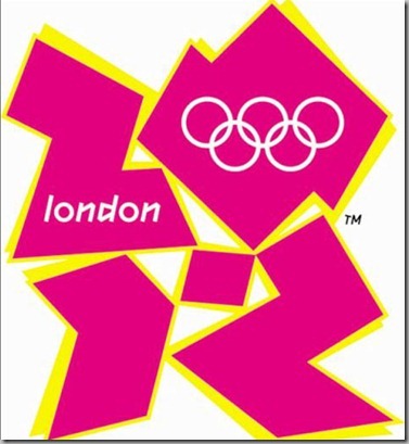
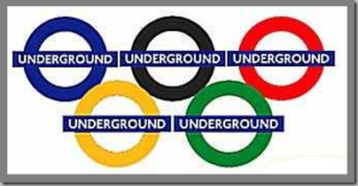
The 2012 London Olympic games begin on Friday and of course, there is a ton of promotional material out there, whether authorized or not. Funnily enough, I really dislike the real logo for the games.
I was wandering around the Guardian’s website this evening and some of the Olympics posters caught my eyes.
This poster for the equestrian events was clever.
And how could I not love this one for the sailing. 


Sort of retro
This reminds me of a series of children’s books about different cities. Who’s the author???
Let us know which your favourites are, and if they’re not here, add a link in the comments.


M Sasek, managed to find This is London in my bookcase, printed in 1963. My sister has I love New York. Aren't they fantastic ?
ReplyDeleteI loved every minute of the Olympics when we had them in Sydney, everyone was in a great mood.
Right! I knew I would instantly recognize the name, but couldn't think of it at midnight. I have the This is Paris book. I even wrote about these books here.
DeleteI just saw your post on This is Paris, and Mr Sasek in Washington. I was fascinated by these books when I was a child, The graphics are still wonderful.
DeleteI have the advantage when you post it's early afternoon where I am.
Usually midnight my time!
Deletesorry This is New York .
ReplyDeleteTop poster features shapes which are really letters that spell ZION.
ReplyDeleteI had heard that when it was first revealed.
DeleteI have yet to find anyone that does like the hideous official logo - and after having it pointed out I can't un-see Lisa Simpson :-)
ReplyDeleteAnd the colours are so garish!
DeleteI agree; the 2012 - Zion - Lisa Simpson poster is a disappointment.
ReplyDeleteWhen you think about what they could have done, it's a huge disappointment.
DeleteI love the Thames intertwined logo as well as the two following. The pink logo puzzled me the first time I saw it and I don't think I realized what it was.
ReplyDeleteReally dislike the pink puzzle logo and they're using that type "font" for everything.
DeleteI really like the Miroslav Sasek-like one the best. You are so right about what might have been.
ReplyDeleteThey could have done such a fun series of these using the Olympic events and London landmarks.
DeleteI am content to have the last 2 posters. xxpeggybraswelldesign.com
ReplyDeleteThose two and the sailing one.
DeleteI'd take the one with the Thames running through it. BooHiss on that Barbie Pink first one. The next to last retro one makes me think of something that could have been done for the 1936 Summer Olympics under the Nazis. That typeface has that connotation for me.
ReplyDeleteI thought that about 1936 also. That hot pink and yellow one is just awful!
DeleteHow interesting about the typeface. It always fascinates me when people don't understand the power of a font.
DeleteYes font is be very evocative and powerful as you say. I also think the three middle ones using the rings, 2012 and the Thames are clever. And the sort of retro one, lots to look at there. Great post !
DeleteI really like the two retro ones the best! They are all very clever though. Great minds!
ReplyDeleteDi
X
Di...are you all getting excited?
DeleteWell, I love them all except for the ghastly pink! Whoever thought that one up?
ReplyDeleteI agree with Carol. All of them looks cool except for the pink one. I like the seventh idea most. Its simple and gives a clear message.
ReplyDelete