One of the things I love most about being on the boards of the AIA and the Baltimore Architecture Foundation is the opportunities I have to see buildings that I’d never otherwise have the chance to visit. One such opportunity presented itself with a tour of the former national headquarters for Monumental Life, later Aeon Insurance.
The building has just undergone a year-long conversion from an insurance cubicle farm to a health-care provider, Chase-Brexton Clinic. Chase wanted to remain in the same neighbourhood where they started, and Aeon wanted to move into new office space on the Harbour, so a deal was done and work began.
I had always assumed from the imposing façade of the building that it would have a grand entry, and I was a little disappointed that it didn’t.
The building, or actually three buildings take up almost one full city block. This part of the building was built in the 1920’s, while money was still abundant. It’s long and skinny, really only about 40-50 feet deep. The entrance, as I said, is rather plain.
There are some details, like the Maryland seal embedded in the floor (translation: manly deeds, womanly words).
There are actually two of these seals, this is from the 1926 building and the one at the top is from the 1939 section. Interestingly, Pittsburgh is spelled with an H on one, but not the other.
There is some beautiful detailing, but it gets a little lost, and I am a little horrified that some of the bulbs in this light fixture have already failed.
These huge bronze doors prevented people from getting to the cashiers.
What’s an insurance company without a fancy board room?
The 1939 building is slightly fancier, but after the Depression, I am sure they didn’t want to give the impression of being too opulent. There are some beautiful book-matched pieces of marble, which the renovation architects proposed to paint over (the horror!). 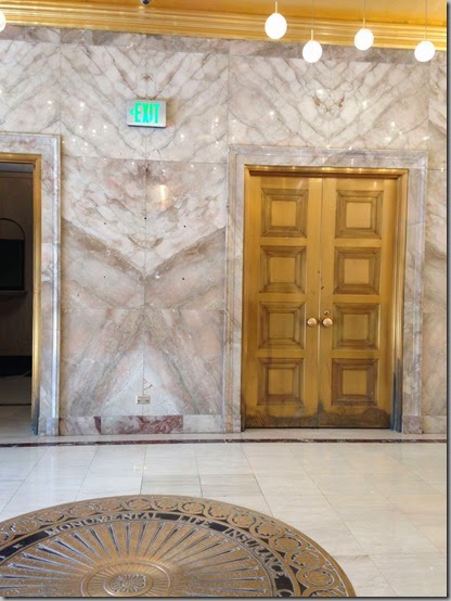
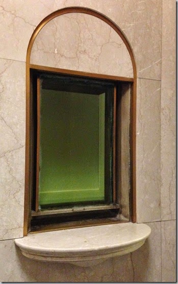
Interestingly, perpendicular to the cashier stations is this odd window. It was the paymaster’s office, and the round hole was for a machine gun.
The one opulent feature that the architects kept was the barrel-vaulted ceiling with the gold-leafing, which was restored.
Special lights were created for the main floor, and they’re much more effective here (because all of the bulbs are lit) and really glisten in the reflective surfaces of the polished marble walls and floors and the gold-leaf ceiling.
All of the medical spaces are ultra modern and every convenience is seen to, including this spinner with the bathroom on one side and the lab on the other, so you don’t have to carry your urine specimen down the hall.
The building is flooded with natural light and many of the doors have opaque glass to let the light in.
While the building is only six stories, the views are really remarkable and look towards the north of the city.
Thanks to the AIA, Chase Brexton and Marks-Thomas Architects for arranging the tour!
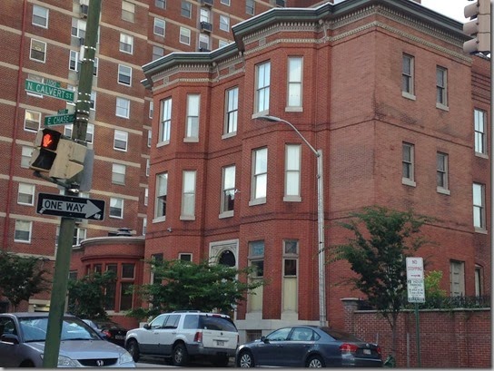
Next week, I will be taking a tour of this house, which doesn’t look like much from the exterior, but is amazing inside!


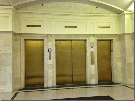







Well, it may be marble but the creepy alien like image I see with the fierce look on the "face" leering out at unsuspecting folks visiting the clinic you say, would for my money , generate comments from those not so artistic. It could make children cry, LOL
ReplyDeleteFunny... i didn't see that!
DeleteI love the restrained elegance from this time period. Great tour! Pittsburgh has always been a bit strange -even in the city itself at this time period some people spelled it Pittsburg and others spelled it pittsburgh!
ReplyDeleteOdd that they wouldn't have spelled it the same way 10 years apart.
Deleteloved the tour + great board you are on. xxpeggybraswelldesign.com
ReplyDeleteThey are great boards.
DeleteThanks for taking us along on the tour. The buildings may not be grand but they are beautiful - what I would call understated elegance. Can't believe that they were going to cover the marble. I'm curious how you came to be on these boards. Are you a trained architect or just interested in the subject? Do tell.
ReplyDeleteYou're right, beautiful, not grand.
DeleteThese pictures remind me of the Fidelity Building, where I worked for most of the 90s. Sadly, the building has been unoccupied for a number of years and is in disrepair. Lots of marble and brass, not to mention a board room similar to the Monumental Building. I was by there last year and seeing the once gorgeous lobby brought tears to my eyes. Thanks so much for sharing. Love that the building has been repurposed!
ReplyDeleteI know that building. It needs to be redone and loved again.
DeleteInteresting building. Paint over the marble? I'd find a new architect! Cant' wait to see next week's house tour.
ReplyDeleteIt was an odd situation - the architect specializes in health-care architecture... not adaptive re-use.
DeleteFor the record, Marks Thomas Architects (the local one) saved the marble. It was another group of designers who proposed painting it.
DeleteSara... tried to figure out how to say the designing architect v the project architect.
DeleteOh, I love those bronze doors and gold leafed ceiling. So glad that the booked marble was left in all of its glory.
ReplyDeleteWishing you a super happy week-end.
Mary
The booked marble was really stunning.
DeleteBy that last picture, I trust you'll be on the tour of Jenkins House with Baltimore Heritage. So will I! Can't wait.
ReplyDeleteI would have been on the tour if the date hadn't been wrong. :-(
Delete