Icon (n) An important and enduring symbol.
I attended a lecture sponsored by the Baltimore Architecture Foundation, entitled “Buildings That Try Too Hard”. The speaker was Witold Rybczynski, the architecture critic for Slate magazine, author of more than fifty articles and papers on the subject of housing, architecture, and technology in the Wall Street Journal, The New York Times, and the New York Review of Books. So, he’s got some credentials! The main take-away point is that the public chooses what’s an icon, not the architect or the client. They are buildings which have a meaning beyond their original purpose, a symbolism. Today, so many clients are asking for an iconic building, but many fail miserably. Generally, a new apartment building is not an icon.
The lecture was divided into four parts: Icons, Instant Icons, Failed Icons and Anti-Icons.
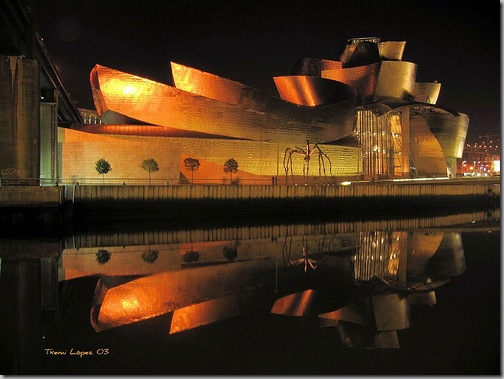
Some of the icons were the Eiffel Tower which was built as a temporary structure, the Empire State Building, long the tallest building in the US, and the Washington Monument. Often these structures were not successful when first built, but gained a stature over the years. One question to ask about an icon is “Can you get the building in salt & pepper shaker form?”. Instant icons are buildings that are purpose built to become an icon. Many times, there is a competition for the building and the most outrageous is selected. Think about the Sydney Opera House, the Guggenheim in Bilbao and the recent Beijing Olympic Stadium. For both Sydney and Bilbao, the buildings basically put these cities on the map.
  Failed Icons are buildings that really illustrate the point of trying too hard. The client figures that the Bilbao Guggenheim attracts millions of visitors, so if we do a titanium-skinned building, with all sorts of swoops and angles, then the visitors will come flocking to the space. Some of the examples of failures are the Millennium Dome in London, the Denver Art Museum, with all of it’s angled walls which are bad for hanging art!
  Anti-icons are buildings that are simple, classic and fully serving the purpose for which they were built. They function as they should, they are not full of jarring elements and pretensions and will continue to look timeless through the ages. Some of these include Seiji Ozawa Hall in Tanglewood, Massachusetts, The Sainsbury Center in Norwich, England and The Museum of Modern Art in Fort Worth, Texas.
 What are your iconic buildings, and what are the ones that you consider failed icons?


oh i'm so jealous -I wish i had known he was coming! He is probably my favorite author and I have all of the books he has ever written! He writes about these subjects which CAN be very dry but he writes in a really entertaining and conversational way. Truly my favorite author and I'm so jealous! Check out any of his books if you get a chance and haven't already!
ReplyDelete*sigh* i live in the land of dull architecture- great weather, bad buildings...
ReplyDeleteHow about that glass pyramid over in gay Paree? Or the Bromo Seltzer Tower in downtown Balto MD -- that's pretty iconic. But nothing in Las Vegas if you please
ReplyDeleteI have always had trouble with the Guggenheim proper, iconic as it is; as with Denver, it overwhelms its are. Grand Central Station, on the other hand has been a wonder for me since early childhood. I also love what's been happening to architecture at the Vermont Studio Center in Johnson Vermont, sort of a fusion of Nineteenth Century New England and American modern/ashcan architecture as done today.
ReplyDeleteOur new local arts center. It had to moved from the old Carnegie Library because more room was needed. The new building, in our historic downtown, looks like a bad 1950's gym. Those who like wear no clothes think it is fab. It is a fabulous job of selling bad architecture just because it is "different."
ReplyDeleteBeing in San Francisco, the Transamerica Building and Coit Tower are two iconic buildings (at least in my opinion). Great post!
ReplyDeleteTrue of all art: "public chooses what’s an icon, not the architect (artist) or the client." PR campaigns help a little but not for the long term. Not sure you really know for a generation or 2. Very few cities have one. Atlanta doesn't but there are certainly some great places here.
ReplyDeleteDoes it have to be monumental? Not if you have "the little mermaid."
Love this post, Meg. I nominate the Disney Concert Hall in L.A. as the best example of intentional, instant icons. Whether it achieves true icon status remains to be seen. Personally, I think it's kind of a mess. For a real L.A. icon, I'll choose the Capitol Records building. Kitschy and gimmicky in its time maybe but everyone knows what they're looking at when they see it in a movie.
ReplyDeleteThis is a great topic for a post. There are too many new buildings trying to be clever however impractical the design might be. In Toronto, the new Liebeskind crystal addition to the Royal Ontario Museum is incredibly bad. It is a startlingly unsympathetic addition to a Renaissance palazzo style edifice, and it wastes valuable space with large irregular corners. It was designed with windows that had to be blacked out because of U.V. considerations and conservation of artifacts. Another disaster is the First Canadian Place, 72 story tower in Toronto. It was built 30 years ago, and faced in soft Carrera marble. The soft marble has now stained to dirty gray, and plates have fallen onto sidewalk below. It seems that in so many instances, the ego of the architect or the client is more important than the purpose of the building. Little, if any, consideration is given to long term maintenance or durability.
ReplyDelete