Thank you for all of the great suggestions that you’ve put in the comments and in e-mails. I really appreciate your input and it’s helped me narrow down colours.
I went to pick up some more paints and came up with four samples. When I gave them to the mixer, he grabbed one of the chips and told me to pick that one. He was a bit surprised that I wanted samples of all four colours. Luckily, Lowes will do the samples in four ounce pots.
I am really narrowing the selection down to a warm yellow. While I really liked the Butter Up in the last post, once I saw it with some other yellows, it seemed flat. I thought having a bit more green or red in the yellow would help give it some richness and depth.
I picked two Laura Ashley shades – Cowslip and Pale Cowslip
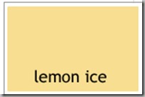
Then I picked a Waverly colour – Lemon Ice
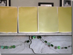
The final shade is called Little Sprout, which is the second sample from the right in the images below. It is so new to the range that it’s not showing up on-line yet. It’s got a lot of green in it.
What I’ve really learned is the limitations of both my camera and my computer to show the exact colours as I see them on the sample boards. The light in my office, both natural and not, really affects the pictures. Also, the settings I am trying on the camera make each image completely different.
Right now, Pale Cowslip is my top choice. Then I will have to check to see what our CEO likes. Please let me know what you think!


Meg- You are so busy-I am with you on the pale cowslip(if for the name alone) really a good illuminating color- G
ReplyDeleteThanks, LA! It seems to have a lot of depth to it. Much more so than the Butter Up.
ReplyDeleteNow that I see the flag art piece, I am thinking you are right about the yellows.I like the pale cowslip out of the choices.
ReplyDeleteI have "deep cowslip" in my entry hall. It is a north facing entrance. There are 5 doors and the front door, baseboard and crown finished in a traditional walnut. I painted the ceiling "pale saphire". The room reminds me of yellow cake with chocolate frosting. The cowslip yellow is a great yellow tone, I think you will like it too!
ReplyDeleteI agree with the pale cowslip. It's such a nice neutral color and can be paired with so many colors for accents. I would vote against the little sprout. In these pictures it kind of looks like pea soup - and kids hate pea soup (so do I :)) Meg, I just found your blog a couple of months ago and I just look so forward to receiving it. As another native Marylander, you help spread the world that Maryland and Baltimore really do have a lot of class - no matter what HBO thinks.
ReplyDeleteI like the little sprout since it is green becuase my choice is still the silver sage!
ReplyDeletePale cowslip (actually I think it was pale cowslip 1 which was slightly lighter) is the color of my kitchen cabinets. It was also supposed to be the color of the walls but the painter wanted to use Duron paints and they did a crap job of matching the color. But when I repaint...
ReplyDeleteI think pale Cowslip is a better direction than those with the green tones (although by nature I prefer green to yellow). However, just returned from looking at Connor + piglet and think the color of Connor's ear would be quite elegant. Don't know if you have read Janice Lindsey's book on color. I found it interesting and the writing was lively.
ReplyDeleteHBD... Connor does have lovely ears. It was very windy here yesterday and we were laughing at his ears flapping in the wind. They're velvety soft, too.
ReplyDeleteI could sell the paint name to Farrow & Ball: Connor's Ears Yellow.
Connor's Yellow
ReplyDelete....laughing...and here I was loving Lancaster Yellow because it reminded me of Nancy Lancaster. I love pale spring yellow and greens..adore them, but for this room; if you're set on Cowslips, do the pale one.
ReplyDeleteYou're getting to the point when you might make larger patches, 2x2m feet or so on the wall, of the top three picks. Its all going to look so much better than beige. For strictly personal reasons, I like the pale green one, but I also like both cowslips. They're all much more lively than the first round.
ReplyDeleteDear Divine Miss M: You know my decorating mantra in life: Why go light on decoration when more will do??? The darker of the cowslips gets my vote.
ReplyDelete(Although really, Connor gets my vote any day of the week!!) ;-)
- Miss M.A.