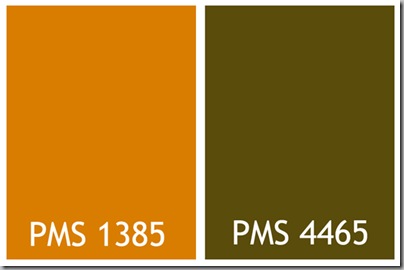
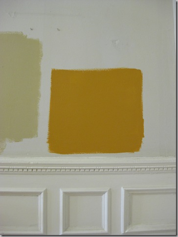
Well, there’s one more colour in the mix. I think we’re coming close, but we’re not quite there. About a year ago, we changed our corporate colours from teal and green (soooo mid-1990’s) to a pumpkin and dark brown.  I thought a shade that was a little warmer than the Spice Bounty that I showed the other day, here, might be a good choice. Luckily, there’s a Duron store about a mile from the office and the guys are getting to know me pretty well. I looked for the exact shade I was thinking of, and came up with Tassel.
  Next to the Spice Bounty, which looks very green, the Tassel looks very warm and rich. Sort of like a nice butterscotch pudding. Maybe just a shade lighter…
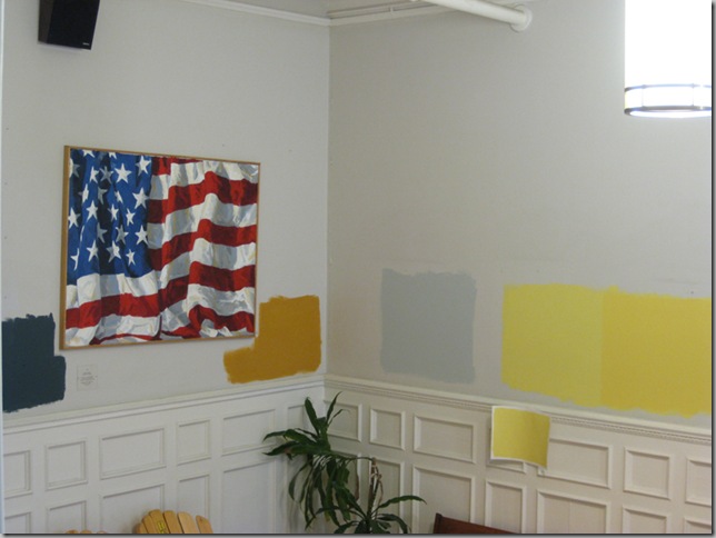
 Right now, we’ve got seven different paints on the wall, but I feel like we’re coming down to the home stretch. I think that if we choose Tassel, we can cut it by 50% with white for the staircase.
I told the CEO that you had weighed in on the colours and had been a terrific help, so… Thoughts???


That was the color of my room in 1978! I loved it. Make sure it's matte though, unfortunately mine was glossy and my four sisters still refer to my room as the "Gulden's" room. I happen to think that Gulden's mustard is more yellow than brown... they disagreed.
ReplyDeletewhat do they know?
Love your header :) ( always do!)
love the header.
ReplyDeletedid you ever connect with Maria - just wondering. i like brown yellows 0r golds, as they are called. i give up though. and i don't see a silver sage up here?? i don't envy you AT all. this is a tough one, very very very tough, imo.
I agree you are melding here. Tassel is warmer, more toward brown but not minding that it is. Glad to see off the I will be happy inspite of everything with no depth yellow. I think Tassel says it's not red, not orange, but more mellow. Next to it, the blues and yellows lack life experience. Wonder what would happen if you asked your clients (the children) and not the CEO. The children, if you will, are the real people involved here.
ReplyDeleteLove the idea of the children putting in their 2 cents worth, it may complicate even more of course! I am still with the buttery yellow.
ReplyDeleteI agree that the children should be asked, but I've always liked the idea of an orange color to warm up all that black and white. You might need a white or black frame on your american flag picture, but that's not hard.
ReplyDeleteThe main rooms in our current house are painted silver sage and while at first I had to convince my husband that gray does not equal sad, we really love how it reflects natural light. (You can see new pics of our house on my blog/ or Joni's at the moment). I think a more neutral color like the sage will work better with the variety of colors in the artwork. I'm not sure that you have to make the connection between your corporate colors and wall colors, though a nice thought.
ReplyDeleteLove that you painted the "pd" on the pumpkins.
Olga ~dancing through paris
You're looking for 'Cardboard' at Sherwin Williams. See it in person...don't trust the website. I spent months looking for a golden brown that didn't have school bus yellow tones.
ReplyDeleteI would have been fired by now.
ReplyDeletehahahahaha HOBAC... so so true.
ReplyDeletemeg, tough job but good job! think a few shades lighter (make sure stays warm like squash soup and not muddy) and you're there. nice warmer color and won't turn green in that blue winter light (KC on same latitude line as baltimore). i'm with others, see what the kids say -- you know how they are painfully honest and speak from the gut.
ReplyDeletenew header is adorbs!
ReplyDeleteTassel is certainly an improvement on the relentlessly upbeat yellows. More dignified as well. There are some
ReplyDeleteexcellent variations on that butterscotch colour in the Farrow and Ball line~a bit more smoked, if you will.
You're on to something here, though if you cut it by
50% with white you'll have the paint equivalent of
Max Factor Pancake MakeUp.
Love the Tassel. I like the warm tone. And the idea of cutting it with 50% white for the stairwell is brillant. Good luck!
ReplyDeleterun don't walk to:
ReplyDeletehttp://colourmehappyblog.blogspot.com
Well I'm missing the context of the rest of the room, but that rich orange is absolutely fabulous! I love it!
ReplyDeleteThanks for all your article mate.....
ReplyDeletedesign
At the rate your going, you'll have one fabulous patchwork quilt of paint samples in your hallway!
ReplyDelete