As I was paging through the Guardian’s Houses & Gardens section, I stumbled across a listing that captured my attention for three reasons:
- It was an old castle
- It was in Wales
- It was featured on Grand Designs, my favourite UK TV show
I clicked on the link to find this:
An 1720’s castle with a modern addition. Hmmm… I am not sure what to think.
Well, it looks like they’ve kept the original front door and the stair case, but it looks like they’ve stripped out the architectural details in the hall.
The little sitting area indicates it’s in the tower part of the house, but the furnishings are too jarring.
It looks like some of the original detail is remaining in the library, but the bookshelves don’t look very original to me, nor do the shutters. 

The kitchen is very modern, not what you’d expect from an old castle. The wife insists that it’s not a custom kitchen, but all off-the-shelf.
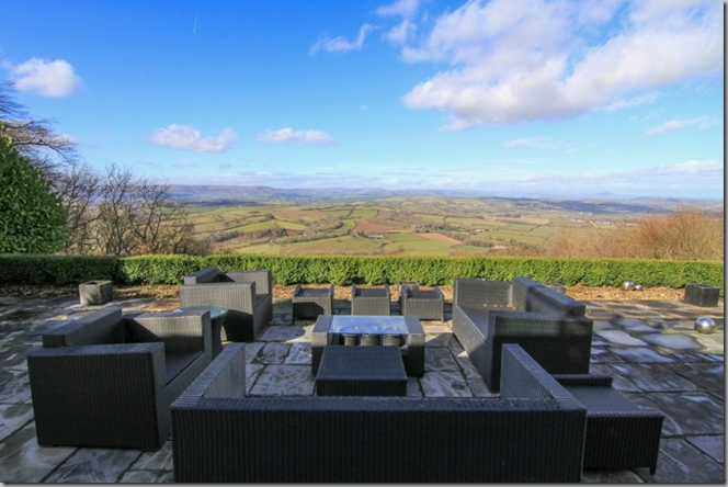
The views from the house are pretty amazing.
I would have like the addition a lot better if they’d used something other than stark white. A shade that blended more with the original stone would have softened this considerably.
Lovely original windows. Completely charmless everything else. And don’t even talk about the curtains and curtain rods.
What I don’t understand is why you would buy an old castle tower/folly and then strip out all of the charm and character. The modern furnishings don’t respect the history of the place.
I managed to find a brief clip of Kevin McCloud from Grand Designs going through the castle with the owners. This is from 2009, when they’d just finished it. The husband is clearly Welsh. Click here to view it (I had trouble embedding it.)
Thoughts?


Yuck.
ReplyDeleteI'm not quite sure why someone would buy a three hundred year old castle if they were in fact really drawn to more modern architecture? What a bad marriage! Looks like a bunch of steel shipping containers super glued onto a hapless
ReplyDeletevictim.
Hello Meg, I know I sound like a broken record on this issue, but I think that an old building should look old. This refers not only to modern additions and decor, but especially to over-restoration of the old components of the building itself.
ReplyDelete--Jim
I missed this episode for some reason!!!
ReplyDeleteI think that aesthetic wise it's too personal to say. But knowing that homes in some parts are neglected into disrepair and places like Wales hust crumble and don't merit enough to get funds. So I am happy someone is making this a home bc otherwise I can't feasibly see it as a second home bc it would be so expensive to run and it's not a popular area for Londoners. I think it's a reflection of the times and a fusion is always so hard.
Dreadful. Why buy old if you want new?
ReplyDeleteI'm thinking Disassociative Personality Disorder vs Schizophrenia.
ReplyDeleteIt looks as if someone stuck an airport lounge on the outside.
ReplyDeleteMcCloud was awfully kind. He's usually so good at putting crazed homeowners in their place. (I watched this show obsessively when I lived in NZ.)
This reminds me of the very modern addition to The Nelson-Atkins Museum of Art here in Kansas City. It was done by a world renowned Architect, it is till sooooo contemporary, and as beautiful it is when inside at an exhibit, from the exterior, for me, NO.
ReplyDeletexoxo
Karena
The Arts by Karena
One must admit the landscape of the property can be enjoyed from the inside with the larger windows. One must also consider the cost-- was the "castle" plumbed when the addition built? It looks more industry conference retreat them home. The no fussy furniture is easy to dust and it looks as if decisions were made with practicality in mind. This wins vs that monstrosity you featured of the Pasta Magnate.
ReplyDeleteHmm - I actually really like the exterior - the addition could never 'meld' so I think going completely modern is a good way to keep original separate from new. Plus it looks well done (on the exterior). The interior looks like a complete re-make from Walmart. Horrid. gut job!
ReplyDeletehmmm + is all I can say. xxpeggybraswelldesign.com
ReplyDeleteAll I can say is TT(Totally Tasteless)!
ReplyDeleteIt is not the most sympathetic addition. Shame.
ReplyDeleteGood architecture, no taste;).
ReplyDeleteAKA, good field no hit.