Or maybe not.
When I was in Wales last month, we had a fun evening out at the local B&Q, which is the equivalent of Home Depot, right down to the garish orange logo. We were looking at wallpapers, ostensibly for Andy’s new house, but really for me. As we hunted around the wallpaper aisles, and who wouldn’t want to push this gorgeous kid around in a trolley hunting for wallpaper, 
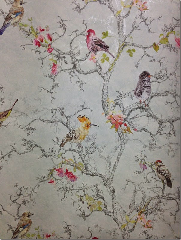
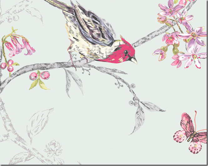
The ground was pale blue and it had metallic accents, but they’re very subtle. Andy bought a couple of the remaining rolls for his house, and I contemplated buying one roll for my house, but I kept thinking of my luggage allowance, all the things I’d gotten at auction and at some antique charity shops, including lots of cutlery, and I decided against it.
Ugh.
I’ve been thinking of it ever since, and I have also been wanting to do something with my bedroom. So I went onto Ebay.co.uk and found a couple of rolls of it, and am contemplating ordering it. Even with the shipping, it will still be less expensive than if I had purchased it in Wales.
Now the big question is do I want to get it in white, or pale blue, which they call teal?
Suggestions?


It's gorgeous Meg! I kinda like the real, has more of a vintage look to it, more of a heritage colour. Go for it!
ReplyDeleteDi
It's is real! Ha!
DeleteBloody predictive text TEAL not real!
ReplyDeleteX
Hate the predictive text. It never says what i want it to!
DeleteVery pretty, who knew their were such treasures lurking within B&Q!
ReplyDeleteShocking, eh?
DeleteThey are both pretty but the white seems more unusual bc those prints tend to come in the pale teal
ReplyDeleteI am worried that it's too stark! The pale teal is really what the bottom two images are, not the one with the chair.
DeleteTeal, teal! Very pretty - like Chinoiserie wallpaper.
ReplyDeleteLike a bargain DeGournay or Zuber paper. Close as I will ever get!
DeleteLove the teal! So gorgeous, Meg! Do it!
ReplyDeleteThanks Sally! Appreciate your vote of confidence!
DeleteTeal.
ReplyDeleteYep!
DeleteBlue! Looks a bit too snowy on white!
ReplyDeleteThat's what I am thinking.
DeleteDefinitely the teal. Killer paper! Love it.
ReplyDeleteThat's why I couldn't stop thinking about it.
DeleteWouldn't either work beautifully on a tri-fold screen?
ReplyDeleteOh, it would! I had a small sample of it to bring home and frame, but realized it would get crushed in my luggage.
DeleteToo gorgeous! Buy it ALL!!!
ReplyDeleteI know! I might buy one extra roll, because it's such a good price...
DeleteDefinitely in Teal
ReplyDeleteDone!
DeleteI'd be afraid that the various dye lots would not match ...so be careful. Don't think you'd get enough for an entire room...but the screen idea sounds like a great idea. It would look fabulous in a corner with the room painted in the matching background...and pick up on the theme (birds/trees/vines) with the rest of the accessories and decor around the room.... Consider checking current sources of wallpaper for similar looks...it's out there, so that way you could do an entire room if you desired. Teal vs. white/cream all depends on the look you want to create...one in soft pastels or one that's more graphic with high contrast and pops of bright color. Good luck!
ReplyDeleteI sent along a note when I ordered the paper to make sure the dye lots matched. My bedroom has big windows on one side, and a long closet on the other side, so i'd really only have to do two walls, and a bit. I ordered three rolls. The teal is so pale, that i hesitate to think of it as teal.
Deletelike anyonymous says be careful of dye lots with the background + Teal would be my favorite. xxpeggybraswelldesign.com
ReplyDeleteI did ask that they all be the same.
DeleteLovely paper - I like the pale blue!
ReplyDeleteThanks, that's the one I chose.
DeleteLove this paper Meg, the white would be my choice!
ReplyDeletexoxo
Karena
The Arts by Karena
I went with the pale blue. I had seen the white in person and liked the blue more.
DeleteI'd love to frame two panels of the blue. What is the name of it?
ReplyDeleteIt might be Ornithological, but I am not sure. It's English, and I've seen it with two names, including that, and Bird & Butterfly. It was also referred to as shabby chic, but I am not seeing that... or admitting that it is!
Deleteteal -no question!
ReplyDeleteDone and dusted!
DeleteI like the white better, but I'm also a brights person. The teal is really washed out, but it would be restful, it would be boring for me. The teal looks like you!
ReplyDeleteThe teal is a lovely pale blue. I think that there are enough bright birds that it wouldn't bother me.
DeleteI had the same decision to make when I was wallpapering a guest bedroom with a Chinoiserie pattern - safe colorway background choices and one with teal. I never considered myself a teal "person", but there was something about the punch of color that struck me. I went with the teal and I love it. I went with COLOR and was rewarded with a room I love to be in. I picked up on the red in the paper for accents and it works really well.
ReplyDeleteTo me, this isn't really teal, but a very pale dusty blue. It's really the bottom two pictures. SInce I've seen both in person - and there was a third colourway in beige - I went with blue.
DeleteNo contest here...go with the teal (blue) background. It gives the images a deeper depth, not just of color, but a richer depth of image. Absolutely beautiful paper! Angela Muller
ReplyDeleteThanks, Angela. That's what I was thinking.
DeleteLove the paper. They're both terrific options, but my vote is for white.
ReplyDeleteThanks, Ben. I actually ended up ordering a couple of rolls of the blue. The white was very bright white.
DeleteI sent my comment before I explained why. I have painted rooms in similar colors, which I adored for a while. A year or two later, however, I grew tired of the color and changed it. Paint is much easier to change than wallpaper, so I would go with something that has a better chance of long term appeal. White is always appealing, in my opinion. But that's just me.
DeleteMeg, I am certain you will be happy with your choice. I LOVE wallpaper.
DeleteI've seen the blue in person and it's pretty pale. The room that it's going in is on the west side of the house and gets a lot of light. I think that this will visually cool it down.
DeleteThe wallpapers at the B+Q far outclassed anything I've EVER seen at the local Home Depot. The English can really do good wallpapers. Ebay's the way to go!
Thanks for your comments!
Hi Meg, charming wallpaper - pleased you chose the blue. You will love it! Can't wait to see where it finds its home.
ReplyDeletexo Terri
So happy you went with the teal, and I hope you see your way to granting us a couple of photos of it once it arrives!
ReplyDelete