I thought I’d do a wrap up of a couple of smaller stories today, instead of one longer one. Enjoy!
. . . . . . . . . . . . . . . . . . . . . . . . . . . . . . . . . . . .
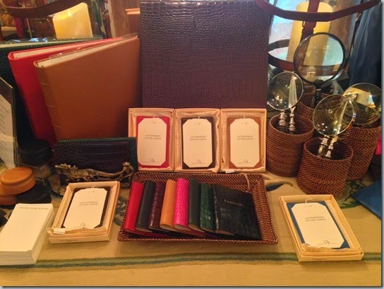
My friends at Halcyon House Antiques are having a major sale this week. 
. . . . . . . . . . . . . . . . . . . . . . . . . . . . . . . . . . . .
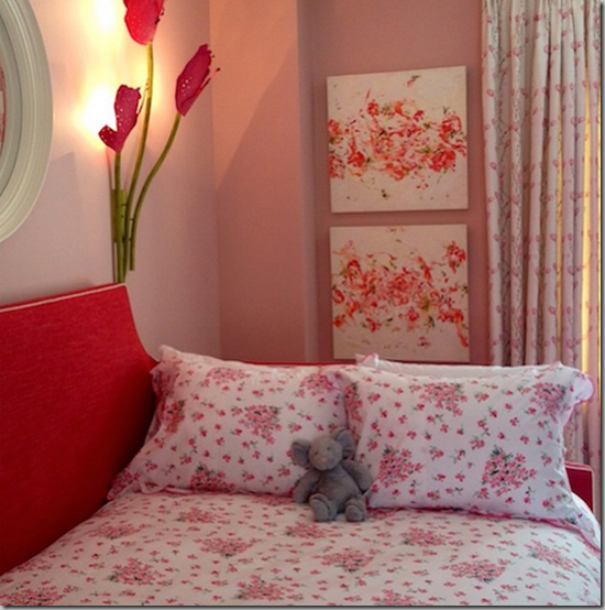
In a case of six degrees of Baltimore, one of my friends sent me the link to a gorgeous chair, and asked if I knew the person who designed the fabric, because she’s from Baltimore, and then a little later, someone asked me to write an article about the very same person – Liza Hathaway Matthews. 

. . . . . . . . . . . . . . . . . . . . . . . . . . . . . . . . . . . .
A few months ago, I wrote about a project I was working on at my office. I showed you some of the before pictures of the room I was refreshing, but since that was one part of a six-part project, I never showed you the finished results!
Just to remind you what the room looked like before:
I have filled the bookcases with antique leather-bound books and other ephemera from our vast collections, so the room finally looks like what it was designed to be – a reading room.
The silver in the case above was found when we finally found the combination to an old safe and opened it one Friday afternoon. I have to tell you, my hands were shaking as I turned the dial for the final time and opened the massive door! I was pretty sure I’d find a skeleton in there!
The paint is Turtleback from C2 Paint, and it’s the most gorgeous paint! The painters told me a number of times how wonderful it was to work with and how beautifully it covered. 
The Reading Room again has the gravitas that it had lost for so many years while it was swathed in pink.
The final part of the project is matching up all of the museum labels with the 110 paintings we have scattered around our offices. Some bright spark pulled all of the plaques and plates off a few years ago, and I’ve spent the past year and a half trying to match up who’s who! You can follow along with my adventures matching paintings here.
What projects are you working on in the New Year?



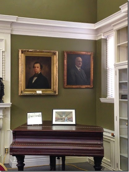
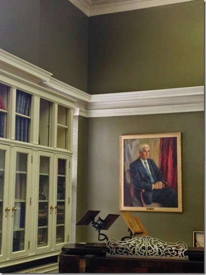


Gosh, what a difference a color makes, well done! The room looks amazing and very pulled together. Absolutely perfect color choice for the gilt frames and mahogany furniture.
ReplyDeleteThanks! Very pleased at how it turned out.
DeleteWhat a splendid color for the reading room. Your refresh has worked wonders. Too bad that the blue Rubbermaid trash bin and the water cooler had to stay.
ReplyDeleteThe bin and water are our efforts to be environmentally friendly. We also don't serve sodas with sugar.
DeleteC2, my go to paint. What a color, what a refresh. Went from Barbies room to Downton Abbey.
ReplyDeleteXo J
Next paint job is going to be with C2 paints. I am so impressed with them.
DeleteBreathtaking, Meg!
ReplyDeleteThanks, Missy! I know you saw it in its former glory (gack!).
DeleteBeautiful. What trim color did you use?
ReplyDeleteTrim is a Benjamin Moore cream. We'd just painted the trim about two years ago, so just did some touch ups.
DeleteI live in a small town and don't know what C2 paint is nor where to purchase it. Can you enlighten me?
ReplyDeleteJanie... C2 Paint is American-made paint, equivalent to Farrow & Ball. Instead of five or six pigments to create the colour, C2 uses up to 16 pigments. It's thick and creamy and covers beautifully. It's available through select paint stores, or by delivery. Check the website in the link in the post.
DeleteGreat job with the room, it looks beautiful. Looking forward to your article on Liza, she's a true artist.
ReplyDeleteThanks! Look for the piece on Liza shortly.
DeleteWow the reading room turned out so great -congratulations!!
ReplyDeleteI am really pleased. It's a great colour!
Deletegood work + a wonderful job you did Meg. xxpeggybraswelldesign.com
ReplyDeleteThanks! It's such a beautiful room now.
DeleteWow, that new paint job is gorgeous - I do like that color with the white trim and what an outstanding background for the framed paintings. I also adore that black handbag with the brown tassel!
ReplyDeleteThe paint really sets off the trim beautifully. I am so pleased with it.
DeleteThe room looks wonderful now - it is much better in high contrast.
ReplyDeleteThe trim just got lost with the pink paint.
DeleteWhat a dramatic difference the new paint makes Meg! Great choice!
ReplyDeletexoxo
Karena
Featuring "Inner Spaces"
Thanks, Karen!
DeleteMeg, Now you need to find what must have been equally stately reading tables and chairs that were in the room....any pictures of the room with the original furniture? The Office Depot folding tables really stick out in this amazing room make over
ReplyDeleteRichard, it's mainly used as a meeting room, so we need the ghastly folding tables. I am trying to make sure that they're not always set up, so you can see the actual room. If you're in the area, come on by and see the building! (We're close to the AIA!)
Delete