Football, as 90% of the world calls it, is having its World Cup this month, and I was taking a moment to look at some of the “kit” the 32 teams from across the world are wearing. From the sublime, to the ridiculous, there’s quite a range. Part of the designers’ mandate was to make sure the uniforms looked good on a HD TV screen, so many of them have subtle motifs.
Considering it’s about a jillion degrees in Brazil at the moment, why would you ever wear all black, Spain?
The USA uniforms look like a popsicle.
Again, it’s hot as hell, so wouldn’t you want to wear something that doesn’t look like a wetsuit, Belgium?
This is the PR shot for Colombia’s uniforms, and they are WRINKLED!
I wonder if Cameroon got Disney’s permission to use the Lion King logo?
Best comment ever: Brazil’s green kit looks like a groundskeeper in a poorly maintained safari park.
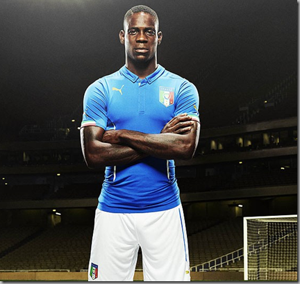
Italy’s sartorial splendor with a button down collar (!)
Subtle nod to the Japanese flag on this one.
Pistachio is an interesting colour choice for Algeria’s uniforms.
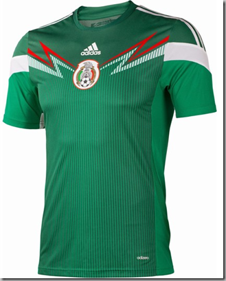
Did a Dead Head design Mexico’s shirts?
Last I checked, lions weren’t native to Holland.
Australia’s socceroos. A bit dark for the temperatures in Brazil.
Croatia’s kit bears a resemblance to a certain fast food character.
If France’s uniforms didn’t look so much like PJ’s, they’d look threatening. 
Which one do you like best? Worst?


Honestly, do those guys care what the uniform/kit looks like this year? They want to get out and play. I guess I like the big boy burger kit --- it gave me the most chuckles after a long day a work. LOL
ReplyDeleteThey might not care, but readers want to know! And since we did the Olympics, we had to do these!
DeleteBrazil is just pure iconic and they stay consistent and I think that is key!
ReplyDeleteRooting for Brazil,eh?
DeleteForm follows function--for the purpose, these uniforms are incredible. They must allow for complete range of motion and withstand abrasion, being pulled, splattered with mud, soaked with sweat, etc. The garish colors help the viewer, especially those of us sneaking a peek at the matches on the tiny screens of our phones or tablets while at work. I agree about the black fabric being hot, but one side has to wear dark jerseys, so the choices are not extensive. I personally really liked the Netherlands' dark blue ones, especially on Van Persie. Speaking as a mom and wife of former recreational soccer players, it is amazing what soccer gear can be put through and survive. I don't think I have ever seen a match where someone's uniform tore or shredded. I have had to donate a lot of old jerseys and shorts because even after constant washing, this gear does not wear out or even fade. Besides, while they may look a little silly standing around in their kit, when you see these World Cup players on the field, they are indeed beautiful to behold! Now, some of the fans are a different story. But they are having such fun in their ridiculous get-ups and face paint!
ReplyDeleteI agree with the colours on the field, but up close, some of them are not good.
DeleteFIFA's rules for kit have changed recently and it has been a disaster for those of us with a purist streak. Take Spain & Netherlands match of last Friday. In the past, you would have seen Spain with red tops and blue shorts while Netherlands would have been wearing orange tops and white shorts. Instead we got Spain in all white (Madrid fans were probably happy, but Barcelona fans probably threw up in their paella) and Netherlands in all blue. Wrong! :) I was also put off by Germany wearing all white, when everyone knows they should have been wearing black shorts.
ReplyDeleteToo garish by half!
DeleteMeg, check out this comprehensive analysis of all 32 looks (home & change kits) from a sports site's perspective. http://www.sbnation.com/soccer/2014/6/5/5777778/world-cup-2014-kits-jerseys-best-worst-photos
ReplyDeleteThanks! I love reading the English newspaper's commentaries. They're hilarious and so irreverent!
DeleteItaly gets my vote. As beautiful as the game is to watch, I've never been able to appreciate the jerseys. I've got two sons who have collected (and worn!) these gaudy things for years. I avert my eyes!
ReplyDeleteI like Italy's, too!
Delete