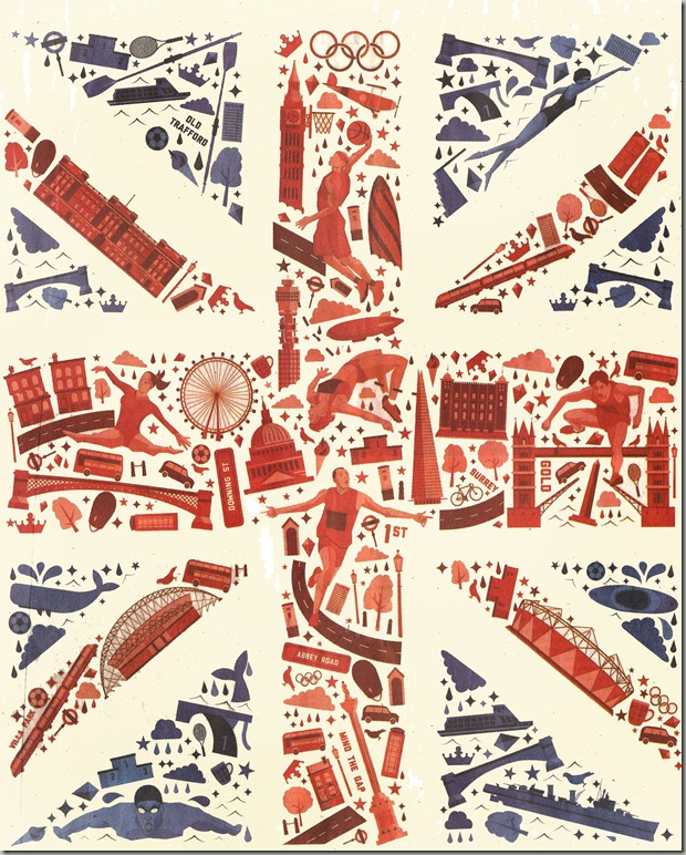
I found this one on the cover of the New York Times’ special London 2012 section that was printed a few weeks ago. It’s such fun looking to find all of the little bits and pieces that represent these summer games.
The only attribution I can find for the illustrator is a little caption in the corner which says, “I Love Dust”, which seems to be a UK-based graphic design firm.


Love it! My favourite for some reason is 'Mind The Gap', bottom in red.
ReplyDeleteWas that graphic design firm born in my house? Must've been...
ReplyDeleteI really love this Meg...thanks for sharing with us.
ReplyDeletexoxo
Karena
Art by Karena
2012 Artists Series
Beautiful! So, how is your new job and how is Connor taking the change of you being home a little more? You could just make this blog about Baltimore houses and Connor and we would be happy. That shingled house was breathtaking. A storybook house. Ann
ReplyDeleteWow, this one is very cool, I haven't seen it anywhere before, great find.
ReplyDeleteLoved seeing you today!!! This poster is fabulous.
ReplyDeletehi Meg, seems I haven't talked to you for ages. To be honest Im Olympiced out! due to time difference they are on TV all night here, and as usual the Australian commentary is pretty awful. However your party sounds like alot of fun, enjoy!
ReplyDeleteThanks for answering my question about Ravens and Orioles, a while ago. My son was pleased by your answer
fabulous...love it... xv
ReplyDeleteBrilliant design. Very well done!
ReplyDelete