I work in a building that was purpose-built for the organization in 1909. There are many beautiful parts of it, but over the years, some of the rooms, which are used several times a week, have begun to show their age. This room, our Reading Room, was last refurbished in 1988, which you will see immediately from the colour scheme of mauve, Williamsburg blue and cream, with chintz curtains in matching shades. 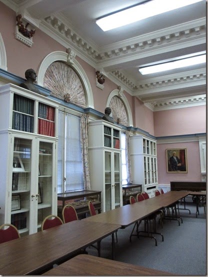
After consulting with one of my best friends, David, who is an interior designer, we decided there were a few mandatory items on the list of things to be done to bring the room back to its original beauty:
First, ditch the ghastly curtains. I told our facilities manager that I wanted to have a ceremonial tearing-down of the curtains and he thought I was serious! 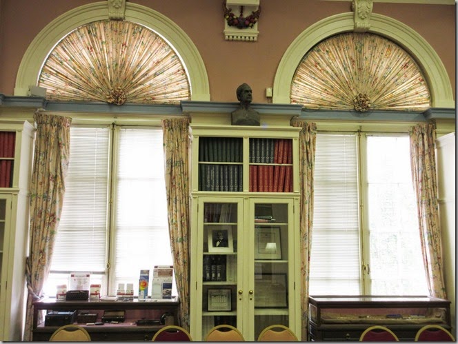

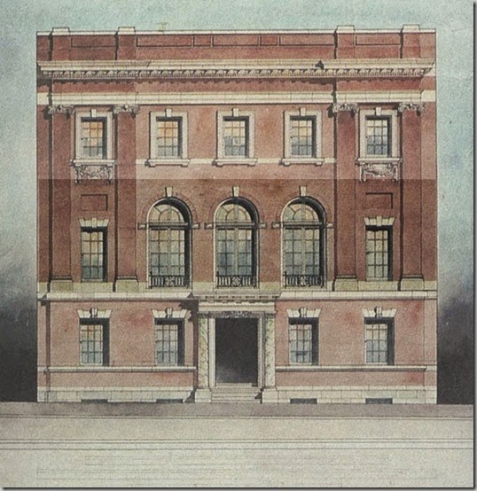
This is the original elevation of the building and I have highlighted the area where we’re working below. So, it’s three full-length windows in the center and two smaller windows on either end of the room.
Second on the list is painting all the blue trim the same cream/antique white as the rest of the woodwork, 
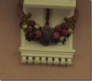
The third item is painting the soffit where the a/c ducts in the room were added. Right now that space has three difference colours and looks very disjointed. David’s suggestion was to paint it the same cream as the rest of the woodwork, so it looks all of a piece. It’s funny how pink the paint looks in the different lights.
After some thinking, and suggestions from the donor who’s funding the project, we chose a gorgeous shade of paint, generously supplied by my friends at C2 Paints. 

Because the long walls are mostly book-cases, windows and doors, we think that this colour won’t overwhelm the space. The tall windows are west-facing, so the room gets lots of great light. And harkening back to its original use, the Turtleback will give the room the gravitas it once had… Not to mention that our earliest members founded the University of Maryland’s School of Medicine, and the school’s mascot is a turtle!
The other thing that’s bothered me about this room is that many of the bookcases are empty! It’s not like we have any shortage of books, with a stacks library just down the hall with an inventory of 50,000 books. 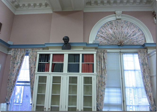
Stay tuned over the next few weeks as we progress on this project!



You have a Great Job! I'm looking forward to the After pictures. This room so needs the love.
ReplyDeleteIt's mostly a fun job!
DeleteThis room is going to be lovely when you have imposed your impeccable taste on it. How will it be furnished?
ReplyDeleteIt is still going to be a meeting room. We need the space. It will just look a lot better!
DeleteLooks like a great project! Can't wait to see the progress of the room.
ReplyDeleteIt is going to be fun to work on this!
DeleteI'd like to know more about your ghost. Have you seen it/him/her?
ReplyDeleteHer name is Marcia C. Noyes. She was our librarian for 50 years, and she lived in the building from the time it was built in 1909 until her death. She was a leading light in the field of medical libraries, and the highest award given each year is named for her. Read more here
DeleteGood plan and great color choice! Will there be room in the budget to provide more aesthetic and comfortable furnishings?
ReplyDeleteIt's still going to be a meeting room, so we need to keep the tables/chairs for now.
DeleteLooking forward to seeing the "afters". You have a fabulous job.
ReplyDeleteThanks. I am excited about it.
DeleteSixteen colors in one shade. Honestly these "colors/tint" are no doubt drops. I thought there were what, four primary colors? I wish a color chemist would weigh in on the perception of a "depth of color" what does that mean? Would not the light in the room be a factor? What kind of bulb for illumination would one use in reading room, there will be lamps no? How will someone reach the top shelf books? Cue the Jerry Lewis movie where he climbs a ladder to get the jar of jelly beans for his childish customers. Thanks really curious how depth of color is achieved .
ReplyDeleteThe people who started this company are all paint and colour chemists. As it's no longer really a reading room, but a meeting room, we're still having overhead lighting. Depth of colour seems pretty obvious. The more tints/shades, the more depth.
Deletewould not depth of color be achieved with glazes the translucent quality of a glaze and building layers.... would not more tints and shades just muddy the result in an opaque solid color??? Just curious
Deletesome of each. you need more colours to make a deeper shade. we're doing an eggshell finish to bring a little sheen to the walls, instead of the current flat paint.
DeleteWhat a relief! It's a fantastic space, but sitting in there for that meeting last spring was kind of painful. I hope the collection of surgical instruments will remain on display. Those were great.
ReplyDeleteEspecially since you were looking at the curtains the whole time! And yes, we're keeping the instruments.
DeleteWhile the dark green is a beautiful colour, the rule of thumb in interior design is to pick a shade - then go two shades lighter. The strong colours favoured today will look very dated in a few years. Not that I go for the brown brown brown brown brown that people are using a lot these days. I flip the pages of the shelter magazines, and all I see are various shades of brown. Everybody seems to want neutral, but that is boring, too. So good for you, Meg, for taking a risk on strong colour. My initial reaction is that it is a bit too much of a good thing. And I am dying for you to prove me wrong.
ReplyDeleteWe actually did go two shades lighter than the original shade. It doesn't read well on the computer, but it's almost a bronzy shade of green. There's also so much cream in the woodwork, and there are huge windows, so the whole room won't read as heavy.
DeleteThere are very few rooms, in the USA at any rate, whose architectural elements would benefit by being played up against a rich dark background. This is decidedly one of them!
DeleteMeg is absolutely on the right track here.
Those curtains!! Can't wait to see the after photos as this room has fantastic bones!!
ReplyDeleteMary
It is a lovely room. There's another big room we have and I am dying to see what's above the drop ceiling!
DeleteI was ever so glad to see the '80s mauve disappear so I know you must be glad to see its cousin retire from this room. (I had a client who called mauve, "mothe.") The curtains remind me very much of curtains that became clothes for the children in "The Sound of Music." Any similar plans for these ones, Meg?
ReplyDeleteHonestly, I am sure the fabric is going to fall apart the minute we take them down. They're on the west side of our building and in full sun, so i am sure the material is ruined. We will send it out with the recycling.
DeleteExcited to see the changes....and I've already checked C2 Paints website!
ReplyDeleteTheir paints are fabulous - and American made.
Deletewhat a relief to see those curtains go + love the color of the paint + can't wait to see the after images. xxpeggybraswelldesign.com
ReplyDeleteThe curtains have always scared me!
DeleteHere the walls are painted with Turtleback and the previously blue area of the moulding is C2's Buffalo
ReplyDeletehttp://pic20.picturetrail.com/VOL94/100083/23169458/409908258.jpg
Thanks! We did that, too! If you have photoshop or pshop elements, you can use the colour replacement tool. It's like MAGIC! I am excited to see how it really looks. We're painting the soffit in the cream, too, so it looks like a complete architectural element.
DeleteThanks again!!!
Glad to read that you are recycling the curtains. Not good when textiles are just thrown in the trash. You might check with DuBois Textiles to see if they could be recycled there. Good luck with the project and can't wait to see the results.
ReplyDeleteI am fairly certain that the curtains are going to be very fragile when we take them down. They've been in place for 30+ years in the hot afternoon sun. They might just go directly to the recycling center to be made into pulp. I doubt the fabric is any good at all.
DeleteWow, I can envision the room already - its going to be so good - that paint color is so perfect for this room!
ReplyDeleteI had a dining room this color a couple decades ago and I loved it - a few months back, Joni - Cote de Texas, did a post about the show 'Southern Charm' and showed Thomas Ravenel's country house - the downstairs main rooms were painted this same dark mossy color and it just becomes luminous in the afternoon light - beautiful. Unfortunately, he recently had it all painted a dull light gray - Joni shows that too - it was so much better in the dark moss brown green as far as I'm concerned. I do want to use this color again - its a great color and seems to enhance anything you put with it.
ReplyDeleteThe donor had suggested Hunter Green, but there is too much blue in it. We needed something with more yellow because the trimwork has a lot of yellow.
DeleteI just checked out the T-Rav dining room and it's gorgeous!
Dear Meg: I understand that the tables & chairs need to stay, at least for now. I personally think that they would "go" with the room a little better if, at least, the tables had some sort of covering on them to hide the utilitarian style. Would table coverings be possible? - Miss M.A.
ReplyDeleteWe are looking into that. Something along the lines of a faux suede, rather than the slippery poly ones we have now.
DeleteCan't wait to see more of this!
ReplyDeletePlantation shutters are a must!
ReplyDeleteThanks, but the plantation shutters won't really work in this room. The three main windows are actually French doors that lead to Juliet balconies.
Delete