I work in a building that was purpose-built for the organization in 1909. There are many beautiful parts of it, but over the years, some of the rooms, which are used several times a week, have begun to show their age. This room, our Reading Room, was last refurbished in 1988, which you will see immediately from the colour scheme of mauve, Williamsburg blue and cream, with chintz curtains in matching shades.  One of my assignments over the next month or so, is to refresh this room and bring it back to what its original purpose was: a reading room where our physicians could study the latest information in one of the more than 65,000 books then in our library.
After consulting with one of my best friends, David, who is an interior designer, we decided there were a few mandatory items on the list of things to be done to bring the room back to its original beauty:
First, ditch the ghastly curtains. I told our facilities manager that I wanted to have a ceremonial tearing-down of the curtains and he thought I was serious! 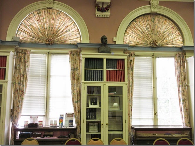 If that picture doesn’t tell you how out-dated the curtains are, maybe this little detail will convince you of my need to get rid of them.
") Yes, someone cut and hemmed the curtain to fit over the radiator. David has suggested that we forgo the curtains altogether, since they don’t really fit the spaces between the bookcases and the windows, and just go with nice two-inch Venetian blinds. That will give the room a cleaner look. And we will leave the top windows plain.
Yes, someone cut and hemmed the curtain to fit over the radiator. David has suggested that we forgo the curtains altogether, since they don’t really fit the spaces between the bookcases and the windows, and just go with nice two-inch Venetian blinds. That will give the room a cleaner look. And we will leave the top windows plain.
This is the original elevation of the building and I have highlighted the area where we’re working below. So, it’s three full-length windows in the center and two smaller windows on either end of the room. 
Second on the list is painting all the blue trim the same cream/antique white as the rest of the woodwork,  and while they’ve got the paint out, they’re going to paint the “fruits and veg” cream.
 They are badly painted in flat paints, and are really quite garish. I think that they will look much better in a monochromatic style.
The third item is painting the soffit where the a/c ducts in the room were added. Right now that space has three difference colours and looks very disjointed. David’s suggestion was to paint it the same cream as the rest of the woodwork, so it looks all of a piece. It’s funny how pink the paint looks in the different lights. 
After some thinking, and suggestions from the donor who’s funding the project, we chose a gorgeous shade of paint, generously supplied by my friends at C2 Paints.  It’s called Turtleback, and is a mossy deep green.
  When you buy paints and have them tinted, the paint store uses three or five tints to achieve the shade you want. C2 paints use 16 colours to make up the paints, and they have so much depth to them. When I knew I was going to be working on the reading room, I knew I wanted C2 paint for the job.
Because the long walls are mostly book-cases, windows and doors, we think that this colour won’t overwhelm the space. The tall windows are west-facing, so the room gets lots of great light. And harkening back to its original use, the Turtleback will give the room the gravitas it once had… Not to mention that our earliest members founded the University of Maryland’s School of Medicine, and the school’s mascot is a turtle!
The other thing that’s bothered me about this room is that many of the bookcases are empty! It’s not like we have any shortage of books, with a stacks library just down the hall with an inventory of 50,000 books.  So today, I measured all of the shelves that need to be filled and it came up to 172 linear feet of books. Some of the shelves already have artifacts and ephemera on them, but I’ve got a lot of spaces to fill. So, I will be heading up to the stacks, where our ghost resides, to mark off books which will be transferred to the reading room, where they’ve probably not been for 75+ years.
Stay tuned over the next few weeks as we progress on this project!


")


