January 31, 2012

BAF Updated

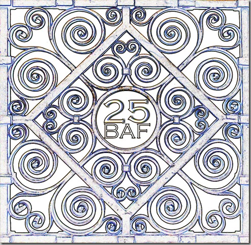
First, thanks to everyone who left a comment or sent me an e-mail about the BAF logo that I created. I played around with the image a bit more and came up with this: I found an old set of architectural plans and then sampled the blues in it. I “averaged” them and came up with this old blue. With the white lines, the pattern is emphasized and the BAF25 stands out more.

We’re planning on sending a postcard to all of our members and friends (e-mail me with your address to get on the list) and decided to use a non-standard size for the card. Since the logo is square and the post card isn’t, I took the sides of the grill and added them to the original piece.top

Then I found an early 1900’s blueprint so I could see how it looked and try to approximate the style. il_fullxfull_272718595Specifically, I liked the print at the bottom, and the architect’s notes. I need to get more detailed information on what goes in these blocks, but I’ve done a little bit of thinking. font The worst part is that I can’t find a font that is similar to the one on this print, and I am getting a bit obsessive about it. Suggestions?

So, without further ado, here’s what I’ve got so far.2012 invitation GHD copyHere’s the reverse of the invitation, with more details about the party.sticker_4.5x4.5  Any and all input is greatly appreciated!

January 30, 2012

BAF 25–Pick One!

As I mentioned, I am designing the invitation for the Baltimore Architecture Foundation’s 25th Anniversary party in the late spring, and I decided on a bronze grill detail for the motif for the party.  I added the 25 and BAF in the center space.

I cleaned up the image, so that the only the brass grill showed. Then I started playing with the image, since I thought it was looking a bit plain. For years, I’ve been using Photoshop, but in my last computer upgrade, I didn’t have the disks to install it, so I am using Photoshop Elements. PSE costs about 15% of what a full PS suite does, and seems to do almost everything I’ve needed it to do.

Image 1:  An embossing filter.

Image 2: Mezzotint

Image 3: Stone carving

Image 4: Neon Edges

Image 5: Rubber stamp

Image 6: Outlines

Now for the hard part. Which one do you like best? The invitation will be a post card directing people to the website, and also several e-mail blasts, as well as a page on our website.

Thanks for your help!

OKL: Are you KIDDING?

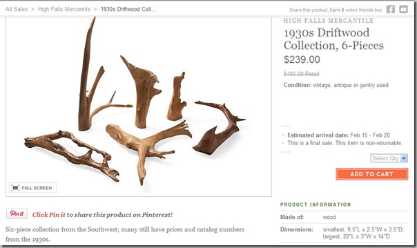
OKL Insanity2Six pieces of driftwood for $239? When was the last time you found driftwood, which by definition is from the coast, in the Southwest, which is generally land-locked?  And how do you really know it’s from the 1930’s?

And just so you don’t think I am the only one who thinks OKL is insane, check my friend Beth over at Chinoiserie Chic. ChinChic Foo DogsShe shows you how to save hundreds of dollars by making your own DIY Foo Dogs.

January 29, 2012

Le Weekend

Ha! I’ve been polishing up on my French as I’ve been applying pages of my 1897 book to the walls of my downstairs bath, but I have realized that one book isn’t going to cover all of the walls. So I popped over to the Book Thing this afternoon to scout some more French novels. My criteria for the books is that they have to have deckled edges on the paper, have some yellowing, not be too text heavy and be old.

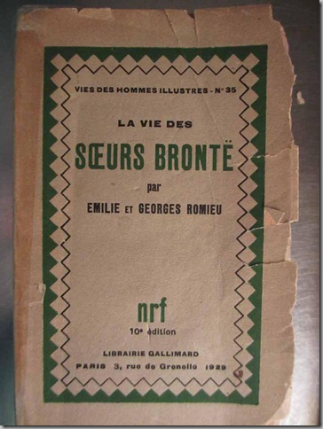
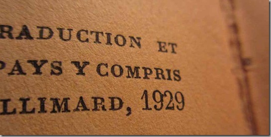
I found a slightly more recent book this afternoon that ticks all of those boxes. La Vie des Sœurs Brontë par Emilie et Georges Romieu.The best thing about this book, aside from the topic, is that it has a few little illustrations. This one is of Anne’s dog, Flossy.And here are the sisters,Anne, Emily and Charlotte, painted by Patrick Branwel Brontë.  The book was published in 1929, and I love that you can see the actual imprint of the letterpress letters on the pages. The book is really too fragile to read and I figure that by pasting up the pages, I am preserving it.

. . . . . . . . . . . . . . . . . . . . . . . . . . . . . . . . . . . . . . . . . . . . . . . . . . . . . . .

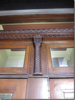
I am scouting a building for the Baltimore Architecture Foundation’s 25th Anniversary Gala in April, so I went by to take some pictures. I was looking for a motif that I could use for the invitation and the collateral materials. It’s an old bank building that’s currently being leased/sold, so we have the use of it.  It’s got so many great details that I thought I’d find the definitive one pretty quickly. Here are some I rejected:
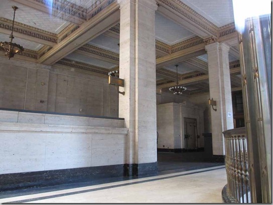
But I did love the whole barley twist, spiral theme ran throughout the decoration on the building.   I managed to peek inside the building and see some of its interesting features, too.

I think I spot the perfect place for the bar!

I loved the Greek Key motif in the tiled vestibule, but rejected that as too common.Of course, I could have taken the classical motif from my old Stubbs shoes!

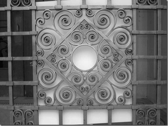
But here’s the piece that really grabbed me. It’s graphic enough to make a good design element, yet unique enough to be indicative of the building.After fiddling around with it on Photoshop, I realized that I needed to get a clear picture of the bronze gate without all of the distractions behind it. So I drove back today to take some more pictures.Naturally, the gates were closed and locked today, so I had to stuck my big piece of tag-board through the bars, and then tape it to the rails, so I’d get a plain background. All the while hoping that no one walked by and questioned me.

I shot some images in black and white,and some with a fill-flash to flatten the image. With a little work – a lot less now that it’s got a plain background – I can start working on the invitation for the party.

. . . . . . . . . . . . . . . . . . . . . . . . . . . . . . . . . . . . . . . . . . . . . . . . . . . . . . .

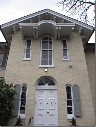
I’ve been asked to help do some fundraising for the Maryland SPCA, so went to meet with them the other day. Their offices are located in a great old 1860’s building. I love all of the gothic-style arches, and especially the little windows on either side of the front door, with their custom shutters. There’s another small building on the property that was originally a pumping station for a reservoir. I could have used this as one of the buildings in my tiny temples series of images.

How was your weekend?

January 26, 2012

LIKE This!

I am lucky to have a lot of talented friends. Shawn and John are two of them. We’ve known each other since our college days, and in the way things are in Baltimore-Smalltimore, Shawn and John’s house backs up to one of my cousin’s houses.

Shawn is the creative force behind the Floral Studio just north of Baltimore,Floral Studioand John’s the bagel-maker extraordinaire at Über Bagel in Ocean City, Maryland… he even went to Bagel University to learn the secrets of making real New York bagels!

Shawn and John are parents of one Jamie Nocher, a talented young actor.jamie2 He’s starring in a new web TV series. Four episodes will post online and then the hope is that it goes to television/cable.  jamie3It’s about a young man who has been living away for a few years and returns home to find things have changed!

It’s such fun to see Shawn’s big smile, bright eyes and blonde hair, and John’s nose and chin on their handsome son.Shawn John, aka P-DiddyI hope you will click on the link to the series, watch the two-minute long trailer and LIKE it, so that Jamie will have a job, and Shawn and John will be happy!

January 25, 2012

Romantic Holiday Getaways???

I was reading the Guardian this evening and spotted a feature on romantic holiday getaways for the Valentine’s holiday. Now, why is it that all of the “romantic holidays” are always stuck somewhere in the country?

This house is in Carmarthenshire in Wales in the village(?) of Manal. Now, I know Wales, and can tell you from experience that a house like this is not easy to get to. You start on a main road, then go to a two lane road, narrowing to a one-lane road, and then generally some sort of cart path, then a narrow track and then another mile or so until you reach the house. Generally, this is done after dark, to make it more fun.manal-exterior-019And since you’re in Wales, you’re going around and around round-abouts, looking for places that have no vowels, like Cym or Ebbw Vale, or Pwll. Do you think you’re going to be in the mood for romance once you arrive?

This one’s in a slightly better neighbourhood – Cambridgeshire.Ellis-Miller-5lg But it looks like you’d been sleeping the weekend away in someone’s carport. No California Case Study houses for me, especially ones transported to Blighty!

This might be fun… it’s called The Piece of Cheese, and is the only three-sided house in England. It was built for a £5 bet in 1871.piece-of-cheese-007I can imagine that the furniture placement’s got to be a lot of work!

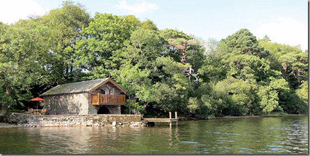
This is kind of fun… it’s a converted boathouse in the Lake District.boathouse-ullswater-ext-017Of course, this might be a little more fun in the middle of July, rather than the middle of February. boathouse-ullswater-016

For me? I’d like a swank hotel,in a city full of hustle and bustle, great places to see art, shop and eat out! What about you?

January 24, 2012

Bits & Pieces

A few little things that caught my eye over the last few days, not enough for a full post each, so I thought I’d add them all together.

First up… I just finished the Duchess book, so when I saw this advert at Stubbs & Wootton, I laughed aloud!StubbsYou can see the Duchess in the little boat with her pugs, and the Duke in his plus fours, with a pair of Stubbs & Wootton’s on. This particular pair has a shark’s jaw with a cornet in the center. There are a few “inside” jokes in this little watercolour: The Duke was responsible for introducing plus fours to America in 1924, in the pre-Wallis days. The Duke and Duchess also had a long history of mooching in Palm Beach, so this is particularly funny. I love the style of these little paintings!

I have worn S+W shoes for years, and they are soooo comfortable. They come in loads of fun patterns and prints and beautiful colours. Check them out here.

. . . . . . . . . . . . . . . . . . . . . . . . . . . . . . . . . . . . . . . . . . . . . . . . . . . . . . . . . . . . . . . . . . . .

I received an e-mail from Liberty of London the other day with their Spring/Summer line of fabrics. Some of them were designed by Vivienne Westwood, antiques guru Martin Miller and students at Central St. Martin’s. I loved this print, taken from a library at Glencot House in Somerset England.  Here’s the library, liberty books

and here’s the print.Dr. Tulloch libraryMartin Miller, author of Miller’s Guide to Antiques, has this great dragon pattern taken from the Liberty archives, with additions from his collections.dragonistaTo watch a film about the new collection, click here. But beware, there’s a lot of background noise and the narrator’s hard to understand at times.

. . . . . . . . . . . . . . . . . . . . . . . . . . . . . . . . . . . . . . . . . . . . . . . . . . . . . . . . . . . . . . . . . . . .

I have two bathrooms at the new house (when does it stop being new?) and the ground floor one is very plain. I have my bike and the hoover hiding in the shower, and a lovely linen shower curtain. I also have some curtains in Schumacher’s Fireworks print in a great mandarin colour. Schumacher Fireworks in Mandarin[2]I had planned to paper the walls with the Turgot Plan de Paris, but it was too hard to match up and when I had a small leak after Hurricane Irene, the ink bled.

When I found some old French novels at Book Thing a few months ago, I had a thought of papering the loo walls with their pages. It took until this week to finally start this project, and it’s turning out rather well. I am applying the pages to the wall with ModPodge, and just painting the wall with it, and not painting over the pages. If and when I decide to change the décor, all I will need to do is wash down the walls to loosen the adhesive. The book is Le Mannequin D’Osier, or the wicker-work woman. It was published in 1897 and the volume I have is the 25th edition.  Here’s a brief summary of the book, translated from the original French. It’s quite a well-known book in France and there’s even a 1980’s movie of the same name. It seems to be about a professor whose wife has an affair with one of his students. I think.It’s always fun to see what people do with small bathrooms where there’s lots of room for creativity in a small space.