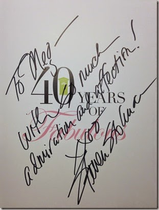
The main reason I went to NYC last week was to attend the launch party for Steven Stolman’s newest book, 40 Years of Fabulous, about the Kips Bay Show House, which is actually celebrating 43 years in 2015. Of course, I couldn’t do that without also going to see this year’s house.
The book party was held at the venerable John Rosselli Antiques on 61st Street, and as good hosts do, both John Rosselli and Bunny Williams were there to greet each and every guest. And of course, there were rooms and rooms of stunning pieces to check out.  One of the first people I spotted was the author himself, and before the hoards arrived, I had the chance to say a few words to Steven Stolman, who is one of the most positive and delightful people I’ve ever met. It was also fun to see some of my NYC buddies, including the talented Emily Evans Eerdmans, and the famous Boy Fenwick, of Reggie Darling fame.
The book is beautiful with more than 200 pages of pictures, each more gorgeous than the next. It is fun to see which rooms have endured, and which are dated.
On Thursday, my friend Jonathan and I met at the Show House, this year in the Arthur Sachs Mansion on 66th Street. We got there at the strike of 11:00, right when the house opens, and I was so glad we did. The house filled up quickly. Although the guides suggested we start at the top and work out way back down, after looking at the stairs, we decided to work our way up!
The entry hall, by Jamie Drake, features an interesting sculpture which looks like clouds reflected against an inky sky. 
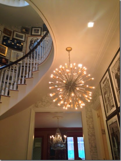
Beyond that was the huge stair hall, soaring up five floors. 
We headed up to see the room everyone’s talking about – the red room by Mark D. Sikes. 


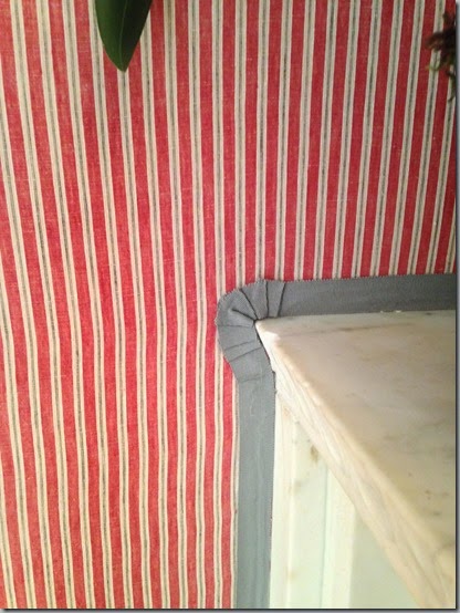
The red room I liked even more was Alessandra Branca’s with its red and white ticking on the walls, as opposed to Mark’s checks.
The detail was really lovely, too.
The next room I loved was the master bedroom. It’s very masculine, but there was a softness to it, perhaps from the beautiful Cowtan & Tout grey plaid on the walls. The room was Designed by
David Pheonix.
I just loved the marble mantle and the alabaster urns. 
To give you an idea of the scale of this room, Jonathan’s about six feet tall and the closet door towers over him. I love this image. 
I almost liked the library shelves, but I am such a purist that it makes me cringe a bit to see books used solely for decoration, with no regard to their contents. 
The details in this room were just stunning. 
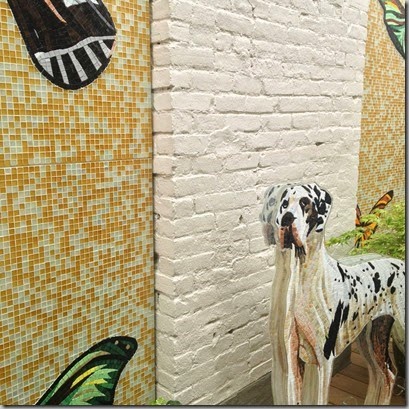
There were two garden spaces, one which I liked and the other which I didn’t. One made great use of space through curtains and mirrors. 
The other was a lot of mosaics and art. 
Another room I liked was more simple than many of the others. It was by Cathy Kincaid, and featured the most gorgeous inlaid bone bed. 
Here’s a little of the detail. 
I loved the calmness of the room, and it didn’t seem like it was trying too hard.
The five-story staircase had everyone talking! Because the elevator “didn’t work”, people were trooping up and down this staircase all day long. It’s lined with art works, hung over a beautiful grisaille wallpaper, which I thought would have been enough on its own.

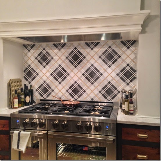
The kitchen, which was on the ground floor, was pretty amazing, although totally impractical. We counted that it was 22 steps from the stove to the fridge and back! This backsplash is all inlaid mosaic marble tiles. Certainly not your standard subway tile!
And this juxtaposition of the rough edge of the wood and the smooth marble was interesting. 
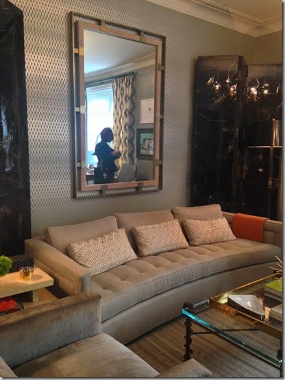
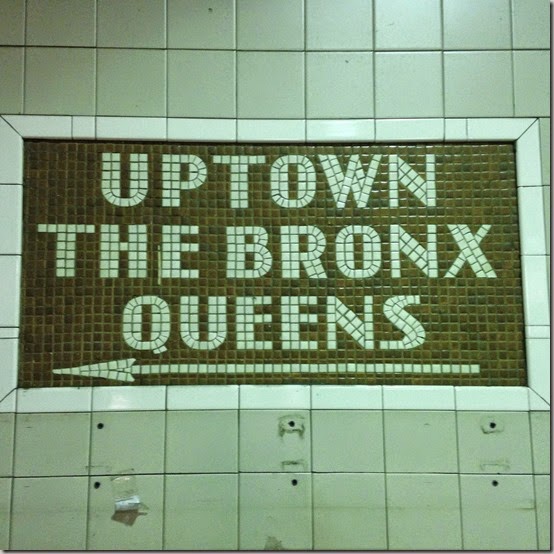
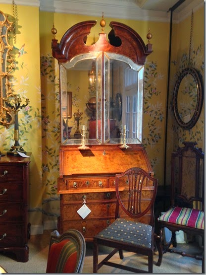
Here are some more images, which I can’t credit, since I can’t figure out which is which! Sorry!


All in all, lots of fun, lots of stunningly beautiful pieces, and a great few days away!


