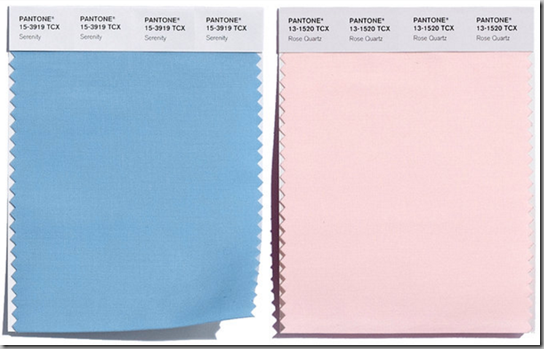
It’s always controversial when Pantone® announces their colour of the year. Remember last year’s Marsala, which was roundly disliked by almost everyone?
This year’s colours are Serenity, a mid-blue and Rose Quartz, a pale pink. 
Actually, Pantone releases a larger range of colours for the coming year. I like a few of them – lilac grey and rose quartz – and dislike a few – green flash and peach echo.
What do you think? Love it? Loathe it?


I think Pantone has lost their mind. I "used" to respect them and their knowledge of color. I don't know what's going on. Glue sniffing? Concussion? Too much....WINE!
ReplyDeleteWell, if one is furnishing a 1960's nursery. I am not a fan. I like Marsala better, and so would half the people who hated it if their monitors were correctly calibrated.
ReplyDeleteDo tell, how does one properly calibrate one's monitor? Hmm that $5 6X8 wool rug I found at a yard sale "it needs a professional cleaning" definitely has marsala threads in it. I dosed it with baking soda and vacuumed it well before bringing it in the house. It is something of a neutral really, but it would look much better on a wood floor -- not my seen -better -days wall to wall carpet
ReplyDeleteType "calibrate" into your "search programs and files" on a PC and it will come up.
DeleteFor me color preference is relative to use and surroundings. Would I ever paint an entire room in Serenity? Green Flash? Absolutely not. But they might find their way into a print or a garden combined with other colors.
ReplyDeleteAgree! As an accent, any of these would be great.
DeleteI'm just surprised they are coming up with uncomplicated one tone colors. If one can't improve on nature then use technology
ReplyDeleteLittle Boy Blue and Baby Girl Pink.
ReplyDeleteHow Pantone established itself as an authority on colour and trends, is anyone's guess.
The whole deal is a contrivance, a fabrication, a fraud...and anyone who takes it seriously hasn't got a brain in his/her head.
IMHO too big a deal is made about Pantone, but I find it a positive effort that by reporting on Pantone the press brings color to the public awareness.
ReplyDeleteHold your horses. Is it not true the industry of home decor needs a cohesive element and if we follow trends (after much focus group testing before the roll out) those bathroom towels in a "current" color will be found in my kitchen towels or valance , the couch accent pillow, the scarf the dress, the tie is this not the point -- an element of being on the same page and fodder of the new for magazine layouts???? Those editors make us fall in love with a weird color. --- if you don't want matchy-matchy
ReplyDeletesuch as I er too much matchy matchy That red and white Ikea duvet cover I found at a tag sale the discounted end of season mushroom and yellow Waverly comforter for different bedrooms...
let's not be too dismissive I want to see how the Work thees colors!!