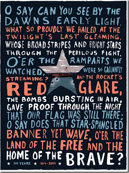
The University of Baltimore had a poster competition in conjunction with the Star-Spangled 200 celebrations, and I’ve just had a chance to see the winners and some of the other posters which were entered. I am continually struck by how creative people are.
The theme of the competition was simple, and what we’ve been focused on all summer: The 200th anniversary of the Battle of Baltimore and the writing of the U.S. National Anthem. And it had to be poster size. That was about it.
Here’s the winner.
Keith Moores Professional Grand Prize
Katie Watkins Student Grand Prize
Stephan Shattuck Award of Excellence
Ana Hayes-Perez Award of Excellence
David Sebastiao Award of Excellence
Sophia Greenbaum Award of Excellence
Daphne Clem Award of Excellence
My sweet friend, Wesley Stuckey - Art Direction and Illustration Award of Excellence
Which poster do you like the best? Why?
For the remaining posters, please click here.


Now 200 years ago the battle was fought, and a poem was , The Defence of Fort McHenry was written by Francis Scot Key. The flag which inspired the poem, lest we forget, according to wikipedia was sewn by a seamstress named Mary Young Pickersgill. I was in my 40's when a co-worker told me as a teenager he worked the summers at Fort Mc Henry, a fact he was very proud of to this day. Now, I don't suppose many people ( unless they read this blog) can answer the question what battle did FSK witness to pen his poem? Which Fort, who sewed the flag, when did it become a popular song , when was it adopted as the national anthem etc etc. Now as a grade school student I would recite the Pledge of Allegiance and sing the National Anthem. How many school children these days know the words to the National Anthem ?? how many have heard all four stanzas sung with any amount of regularity?? With these thoughts in mind, I very much like the poster created by Wesley Stuckey.
ReplyDeleteMany thoughtful and creative entries Meg! Congratulations to the winner and to all who entered!
ReplyDeletexoxo
Karena
The Arts by Karena
I liked your friend's, and the one that has the big O in the center.
ReplyDeleteTo me the poster should focus on the lyrics - they are the heart of the matter.
My favorite is Katie Watkins'. I love the vintage feel of it.
ReplyDeleteI like the Katie Watkins one also. It captures the "whole thing" in a neat graphic way.
ReplyDelete