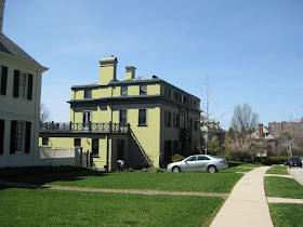
I opened up Photoshop and started playing around with the picture, adding colours and changing them. I finally settled on a pale yellow, which I thought would look nice with the dark greenish-gray shutters. Here are the before and after shots.
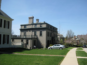
Side view before:
Side view after:
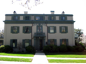
Front view before:

Front view after:
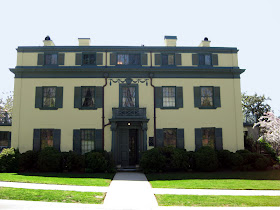
I think that the new colour warms up the house and makes it less austere. What do you think?

Oh, that looks soooo much better! Wonder why the house (and the house next door for that matter) doesn't have any trees out front? It so need some huge trees! I don't have PhotoShop, looks like a fun tool!
ReplyDeletejoan
much improved! now the trees, please!
ReplyDeleteM21... I don't know if my mad PS skilz are up to adding trees!
ReplyDeleteYou are just a giver, Meg. No one even asked you, yet you volunteered your opinion about this house. ;-) I think you should get to redesign whole neighborhoods.
ReplyDeletePS- Love the new header.
What do I think? Two thumbs way up.
ReplyDeleteMamacita...just doing my bit to beautify Baltimore!!!
ReplyDeleteMrs. B... we know you like a yellow house.
It's amazing how a little good color goes a loooooooong way! Nice choices, and amazing PS skills!
ReplyDeleteDear God, Baltimore has such lovely houses. I've driven through it, street after street, and am generally amazed how much lovelier Roland Park, et cetera, are than many similar spots. And I love that house very much. It's like a pasteboard stage set; one half expects to peek around the side and find nothing but wood supports and tumbleweeds. It reminds me, a bit, just a bit, of the Chick Austin house, in its sense of unreality. But the Baltimore one is rather blocky from the side, lacking in grace, perhaps, but not charm.
ReplyDeleteThanks for the link love Meg! Plus, great job with PS. I haven't yet figured out how to change whole wall colors.
ReplyDeleteyes - how did you do that - I always play around and get nowhere. Layla amazes me with her skills. like the yellow much better! what colors didn't look as good I wonder?
ReplyDeleteI always say I can't live with yellow but love it when I see it. This I could live with.
ReplyDeleteit takes it from looking like a bank to someplace elegant. you're right, 'less austere'
Yellow is the subject of the day. Being a flower lover i have to say I adore that tulip header Meg. Totally gorgeous, xv.
ReplyDeleteI love when you say things like "my mad PS skilz" :-)
ReplyDeleteI would paint the shutters and trim gray (it looks green on my screen).
Are those downspouts on the front, on either side of the front door? Maybe it's just me, but I find they distract from the beauty of the front of the house. I think I'd try to re-route them. It really is a gorgeous house.
ReplyDeleteKathy... I remain surprised by the downspouts on the front. I think that they're patinaed copper, but I would have painted them to match the house colour. That said, they do help frame the swagging.
ReplyDeleteStay tuned for a photoshop post where i tell you all of my PS secrets!
ReplyDeleteLove it and that house is amazing!!
ReplyDeleteMuch better. Goodbye scary mental hospital, hello happy house! Still needs trees and flowers though. Do some more of your photoshop magic, print it out and stick it in their mailbox. Would that be wrong?
ReplyDeleteI am looking forward to the photoshop secrets.
ReplyDeleteNice work on that house.
Maybe you need to come use your skills at the magazine!
ReplyDeleteI think I need to get Photoshop & start learning it with some of your suggestions!
ReplyDeleteHa! Perhaps you should print these and drop them off in their mailbox? ;-)
ReplyDelete